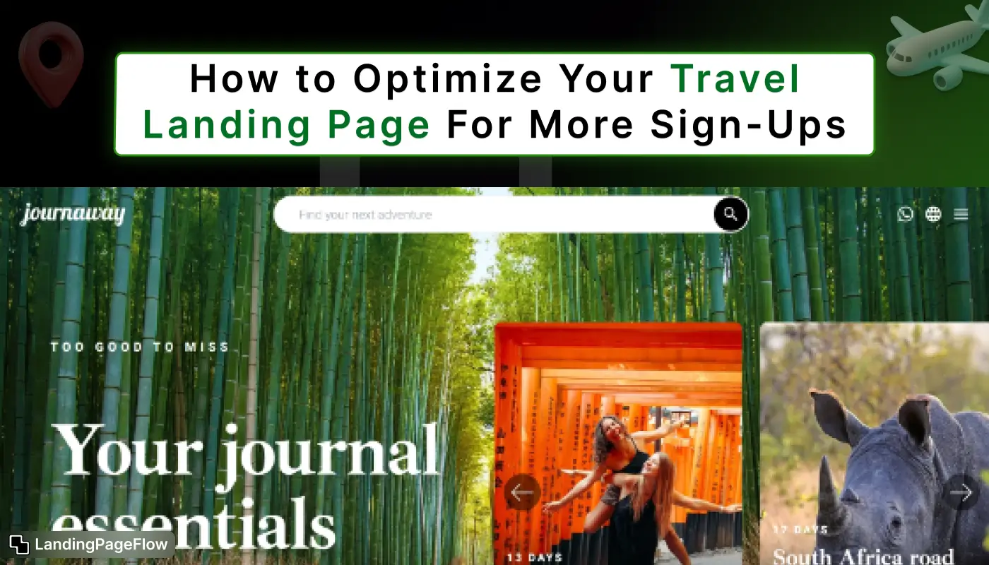
A well-optimized travel landing page captures attention and converts visitors into subscribers. Using captivating imagery instantly inspires users to explore your offerings and destinations.
Clear headlines and concise copy communicate benefits and encourage visitors to act. Strong calls-to-action guide users toward signing up, booking trips, or requesting more information.
Including social proof, testimonials, and reviews builds trust and credibility among travelers. Responsive layouts ensure your page looks professional across desktops, tablets, and mobile screens.
Fast loading times and minimal distractions help keep the visitor focused on the main goal. These techniques help your travel landing page generate more sign-ups and encourage lasting engagement.
"Want more bookings and subscribers?
Download your free travel landing page guide now."
Table of Contents
- Understanding Your Target Audience
- Crafting a Compelling Headline
- Creating an Engaging Visual Experience
- Utilizing Clear Call-to-Actions (CTAs)
- Showcasing Social Proof
- Streamlining the Sign-Up Process
- Implementing SEO Best Practices
- A/B Testing and Analytics
1. Understanding Your Target Audience

Before diving into design and optimization, it’s vital to understand your target audience. Identifying who they are, what they seek, and how they behave online can inform your entire strategy.
a. Demographics
Consider the following demographics:
- Age: Different age groups have distinct travel preferences. For instance, millennials may be interested in adventure travel, while older adults might prefer comfort and relaxation.
- Gender: Understanding gender distribution can help tailor marketing messages. For example, women might prioritize safety and security when traveling.
- Location: Know where your audience is coming from. This can help personalize content, such as local deals or regional travel tips.
b. Pain Points
Identifying your audience's pain points can inform your messaging and content:
- Budget Constraints: Many travelers are looking for affordable options or special deals.
- Time Management: Busy professionals may struggle to find the time to plan a vacation.
- Information Overload: With countless travel options, travelers often feel overwhelmed by choices.
c. Motivations
Understanding what drives your audience to travel can help you create more relevant offers:
- Exploration: Many travelers seek new experiences or adventures.
- Relaxation: Some might travel primarily to unwind and destress.
- Cultural Experiences: Learning about different cultures can be a significant motivator for many travelers.
By deeply understanding your target audience, you can tailor your landing page's content and design to resonate with their needs, increasing the likelihood of sign-ups.
2. Crafting a Compelling Headline

The headline is one of the first things visitors notice, so it needs to be impactful. Here are some strategies for creating an effective headline:
a. Clarity
Make sure your headline communicates what you offer. Avoid jargon and complicated phrases. For instance, instead of "Comprehensive Travel Planning Solutions," use something like "Plan Your Dream Vacation Effortlessly."
b. Highlight Benefits
Focus on the advantages visitors will gain by signing up. Phrases like “Unlock Exclusive Travel Deals” or “Join Our Community for Expert Travel Tips” emphasize value.
c. Incorporate Keywords
Using relevant keywords not only helps with SEO but also makes your headline more discoverable. Research keywords related to your niche and integrate them naturally into your headline.
3. Creating an Engaging Visual Experience

Visual appeal is critical in capturing the attention of potential sign-ups. Here’s how to enhance the visual experience on your travel landing page:
a. High-Quality Images
Use stunning, high-resolution images that evoke the essence of travel. Showcasing beautiful destinations, vibrant cultures, and happy travelers can create an emotional connection with visitors.
b. Videos
Incorporate engaging videos that tell a story about your travel offerings. Videos can be a powerful tool for capturing attention and conveying information effectively, whether it’s showcasing a travel experience, customer testimonials, or destination highlights.
c. Consistent Branding
Maintain consistent colors, fonts, and styles that align with your brand identity. A cohesive design enhances professionalism and helps build trust with your audience.
d. Whitespace
Don’t overcrowd your landing page with images and text. Using whitespace effectively allows the content to breathe, making it easier for visitors to digest information and find CTAs.
4. Utilizing Clear Call-to-Actions (CTAs)
.webp)
Your CTAs guide users toward the desired action, and signing up. Here’s how to ensure they are effective:
a. Make It Stand Out
Use contrasting colors for your CTA buttons to ensure they catch the visitor's eye. The text should be action-oriented and enticing, such as “Sign Up Now,” “Get Started,” or “Join the Adventure.”
b. Placement Matters
Position your CTAs strategically throughout the page. Place them prominently above the fold, in the middle of the content, and at the bottom to ensure maximum visibility.
c. Create Urgency
Encourage immediate action by incorporating urgency in your messaging. Phrases like “Limited Time Offer” or “Join Now and Get a Free Travel Guide” can spur visitors to take action sooner.
5. Showcasing Social Proof

Social proof is a powerful motivator for potential sign-ups. It builds trust and credibility for your travel business. Here are ways to showcase social proof effectively:
a. Testimonials
Incorporate quotes from satisfied customers who have used your services. Use real names and, if possible, photos to enhance authenticity. Testimonials can help alleviate fears or doubts potential customers may have.
b. User Reviews
Highlight ratings from popular travel review platforms. A high average rating can instill confidence in potential sign-ups. Encourage satisfied customers to leave reviews on platforms like Google, Yelp, or TripAdvisor.
c. Case Studies
Share success stories that demonstrate the value of your service. For example, a traveler who saved money, discovered hidden gems, or made lasting memories through your platform can make a compelling case for why others should sign up.
6. Streamlining the Sign-Up Process

A complicated sign-up process can deter potential users. Here’s how to simplify it:
a. Minimal Form Fields
Only ask for essential information. For instance, name and email address may be sufficient for initial sign-ups. Avoid overwhelming users with too many questions upfront.
b. Use Progress Indicators
If your sign-up process involves multiple steps, use progress indicators to inform users how many steps are left. This transparency can encourage users to complete the process.
c. Provide Multiple Sign-Up Options
Allow users to sign up using social media accounts (like Facebook or Google) to streamline the process. This reduces friction and can significantly improve conversion rates.
7. Implementing SEO Best Practices

Optimizing your travel landing page for search engines is vital for attracting organic traffic. Here are key SEO practices:
a. Keyword Research
Identify relevant keywords related to your travel niche and incorporate them into your headlines, content, and meta descriptions. Tools like Google Keyword Planner and SEMrush can help in identifying high-volume keywords.
b. Meta Tags
Write compelling meta titles and descriptions that encourage clicks when your page appears in search results. Make sure to include your primary keywords and a clear value proposition.
c. Image Optimization
Use descriptive file names and alt text for images. This helps search engines understand your content better and improves accessibility for visually impaired users.
d. Internal Linking
Link to relevant pages within your website to enhance navigation and improve SEO. This not only helps search engines crawl your site better but also keeps users engaged longer.
8. A/B Testing and Analytics
Continuous improvement is key to optimizing your travel landing page. Here’s how to leverage A/B testing and analytics:
a. A/B Testing
Experiment with different headlines, CTAs, images, and layouts. Test one variable at a time to identify which elements lead to more sign-ups. For example, you might test two different headlines to see which resonates more with your audience.
b. Analytics Tracking
Use tools like Google Analytics to track visitor behavior on your landing page. Analyze metrics such as bounce rates, time spent on the page, and conversion rates. This data will help inform your optimization strategies.
c. User Feedback
Gather feedback from users to understand their experience. Tools like surveys or heatmaps can provide valuable insights into what is working and what needs improvement.
Conclusion
Optimizing a travel landing page enhances conversions and strengthens your brand presence online. High-quality visuals paired with persuasive copy leave a memorable impression on potential travelers.
Strategic placement of CTAs ensures visitors know exactly where to take action next. Highlighting social proof builds credibility and encourages more confident sign-ups.
Mobile-friendly design ensures users enjoy a smooth experience on any device. Continuous testing and updates improve performance and maximize sign-up rates over time.
Investing in thoughtful design and clear messaging delivers measurable results for your travel campaigns.

FAQ
1. Why should I optimize my travel landing page?
Optimization increases sign-ups, boosts engagement, and improves overall conversion rates.
2. How do visuals impact landing page performance?
High-quality images inspire visitors, showcase experiences, and encourage users to take action.
3. Should I include social proof?
Yes, testimonials, reviews, and ratings build trust and motivate users to subscribe or book.
4. How can I make my page mobile-friendly?
Use responsive design techniques so your page looks great and functions well across all devices.
5. What kind of CTA works best for travel pages?
Clear, action-oriented CTAs like “Book Now,” “Sign Up,” or “Discover More” guide users effectively.
6. How often should I update the travel landing page?
Regular updates keep content fresh, showcase new destinations, and improve conversion performance.


.webp)


