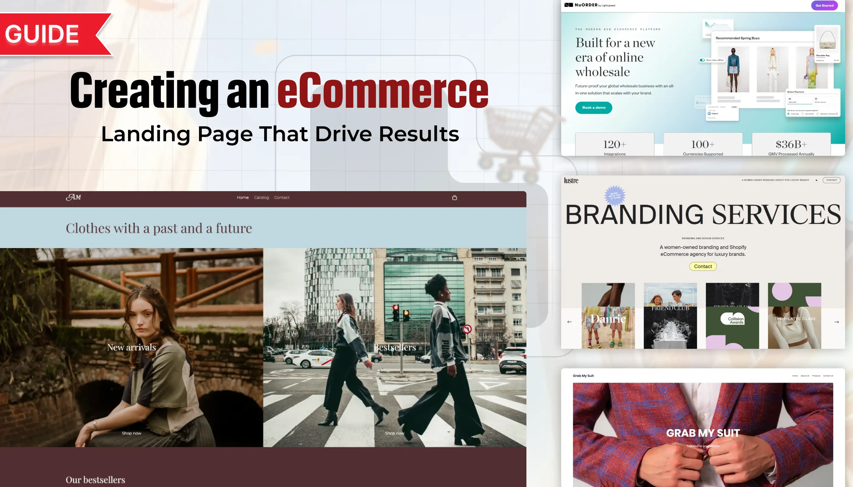
A strong eCommerce landing page is the foundation of online sales success. It acts as the first impression for potential buyers and sets the tone for their journey.
Every detail matters, from the headline to the product showcase, and even the call-to-action that drives customers forward. A page that looks appealing but lacks clarity will likely push visitors away.
Designing for conversions means aligning your layout, visuals, and content to create a clear path that encourages action. Visitors should feel confident and motivated to purchase.
A high-performing eCommerce landing page is not about stuffing features but presenting value in a way that resonates instantly. The right messaging ensures people stay longer and engage more.
Visual hierarchy, contrasting buttons, and persuasive copy all contribute to how well your page can convert. Small adjustments often lead to major improvements in performance.
"Struggling to make your landing page perform?
Unlock your free eCommerce strategy session & grow sales fast."
Table of Contents
- Introduction
- Understanding Your Target Audience
- Key Elements of a High-Converting eCommerce Landing Page
- Step-by-Step Guide to Building Your Landing Page
- Optimizing For Conversions
- Best Practices For eCommerce Landing Pages
1. Introduction

Creating a landing page for an eCommerce site differs from a typical product or home page.
Unlike these pages, a landing page has a singular focus: driving conversions for a specific product or campaign.
Whether your goal is to sell a product, launch a sale, or gather leads, an optimized eCommerce landing page can be the key to turning clicks into customers.
Let’s dive into how to design a compelling, conversion-focused landing page for your eCommerce business.
2. Understanding Your Target Audience

Before building your landing page, take time to understand your audience’s needs, preferences, and pain points. Consider these aspects:
- Demographics: Age, gender, location, and income level can influence design choices and messaging.
- Shopping Behavior: Knowing if your customers prefer discounts, quality, or product uniqueness can help tailor your approach.
- Pain Points: Identify what issues or desires your product solves for the customer.
Understanding your target audience allows you to create a page that speaks directly to their needs, making them more likely to convert.
3. Key Elements of a High-Converting eCommerce Landing Page

Every successful eCommerce landing page typically includes these components:
- Hero Image or Video: Showcase the product with high-quality visuals.
- Compelling Headline: Convey what the product is and why it’s unique.
- Clear Call-to-Action (CTA): Direct the user to take the next step, such as “Buy Now” or “Add to Cart.”
- Trust Signals: Customer reviews, ratings, and testimonials help build credibility.
- Product Details and Benefits: Focus on how the product solves a problem or meets a need.
- Limited-Time Offers: Urgency and scarcity (e.g., “Only 5 left!” or “Limited time sale!”) can encourage quick action.
4. Step-by-Step Guide to Building Your Landing Page

Step 1: Choose a Relevant Template or Build From Scratch
- Many platforms, like Shopify, Wix, and WordPress, offer landing page templates you can customize for eCommerce. Start with a template or build one with HTML, CSS, or a page builder that fits your brand’s aesthetic and functionality needs.
Step 2: Create a Strong Headline
- Your headline is the first thing visitors will read. It should immediately convey the product’s unique value proposition, such as “Effortless Style, Delivered to Your Door” or “Organic Skincare Made Simple.”
Step 3: Use High-Quality Product Images or Videos
- High-quality visuals are essential for eCommerce. Show the product from multiple angles and contexts to help customers visualize how they would use it. Videos are particularly effective for showing products in action.
Step 4: Write Persuasive, Benefit-Focused Copy
- Describe what makes the product special. Focus on benefits rather than features alone. Instead of “Made of durable leather,” try “Crafted from durable leather that lasts for years.” Highlighting what makes the product useful or unique creates a stronger connection.
Step 5: Add Social Proof
- Including customer reviews, testimonials, or user-generated content like photos and videos can increase trust. If your product has received positive feedback, showcase this as evidence of its quality.
Step 6: Create a Bold, Clear CTA
- Make your CTA prominent and action-oriented. Use language that emphasizes immediacy, such as “Shop Now,” “Add to Cart,” or “Get Yours Today.” Keep it in a color that stands out from the rest of the page.
Step 7: Include Trust Signals and Certifications
- Trust signals like secure checkout icons, money-back guarantees, and “free shipping” can ease buying concerns. Trust badges like “Verified,” “Money-back Guarantee,” and secure payment icons reassure customers about their purchase.
Step 8: Highlight Any Offers or Discounts
- Adding urgency with a time-sensitive offer can drive conversions. For example, “Get 20% off until midnight!” or “Free shipping on orders over $50” can encourage visitors to act fast.
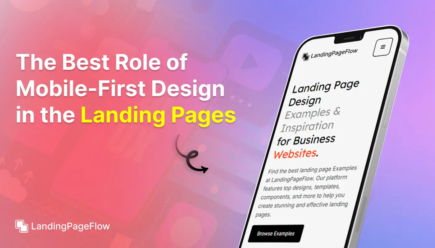
Step 9: Optimize For Mobile
- With many shoppers browsing on mobile devices, ensure your landing page is responsive. Text should be easy to read, images should load quickly, and CTA buttons should be clickable on smaller screens.
Step 10: Add an Exit-Intent Popup (Optional)
- Use exit-intent popups to capture visitors who may leave without converting. Offer a discount code or invite them to join a mailing list. Keep the message clear and value-driven.
5. Optimizing For Conversions

To maximize conversions, consider these optimization techniques:
- A/B Testing: Test variations of headlines, CTAs, images, and copy to see what resonates best with your audience.
- Page Load Speed: Slow load times can result in high bounce rates. Compress images, optimize code, and use caching to improve speed.
- Funnel Tracking: Use tools like Google Analytics or Hotjar to analyze visitor behavior on your landing page. Track where users drop off to find areas for improvement.
6. Best Practices For eCommerce Landing Pages

a. Focus on Benefits Over Features
- Emphasize what the customer gains from the product, not just what it does.
b. Keep It Simple
- Avoid clutter and keep messaging concise. Too much information can overwhelm visitors and reduce conversions.
c. Use Contrasting Colors For Your CTA
- Make sure the CTA stands out by using a bold, contrasting color.
d. Maintain Consistent Branding
- Use your brand’s colors, fonts, and tone of voice to create a cohesive experience. This builds trust and reinforces brand identity.
e. Showcase Customer Testimonials and Reviews
- Show real experiences from past customers to help new customers feel confident about their purchases.
Conclusion
A sales-driven eCommerce landing page requires clarity, trust, and seamless flow. Every element should guide visitors toward completing their purchase confidently.
Investing in design and strategy helps create a shopping experience that resonates and encourages repeat buyers. Customers remember brands that make things simple.
Strong visuals paired with persuasive messaging build confidence at every step. Each detail contributes to creating a frictionless journey that increases satisfaction.
Retailers that focus on customer-centric pages often see higher conversions and improved retention. Smart design choices, simplified navigation, and impactful CTAs ensure your page delivers results.
Trust factors such as reviews, secure payment options, and guarantees go a long way in reassuring buyers and removing hesitation.
Your eCommerce landing page is more than a sales tool; it’s the digital gateway to your brand. Confidence fuels conversions.

FAQ
1. What makes an eCommerce landing page different from a homepage?
A homepage is broad and covers many areas of a brand, while an eCommerce landing page is focused on driving a specific action, like purchasing or signing up.
2. How many CTAs should an eCommerce landing page have?
It’s best to use one primary CTA repeated strategically. Too many different CTAs can distract users and lower conversion rates.
3. Do product reviews increase conversions on landing pages?
Yes, customer reviews and testimonials serve as trust signals, helping potential buyers feel more confident in completing a purchase.
4. How important is mobile responsiveness for eCommerce landing pages?
It’s critical. Most shoppers browse on mobile devices, so a mobile-optimized landing page ensures smooth navigation and higher conversions.
5. What design elements influence buying decisions the most?
Strong visuals, clear value propositions, persuasive copy, and visible trust indicators often have the biggest impact on buying behavior.
6. Should I use video on my eCommerce landing page?
Yes, if used wisely. Short product videos can increase engagement and provide clarity, but they should not slow down the page speed.


.webp)


