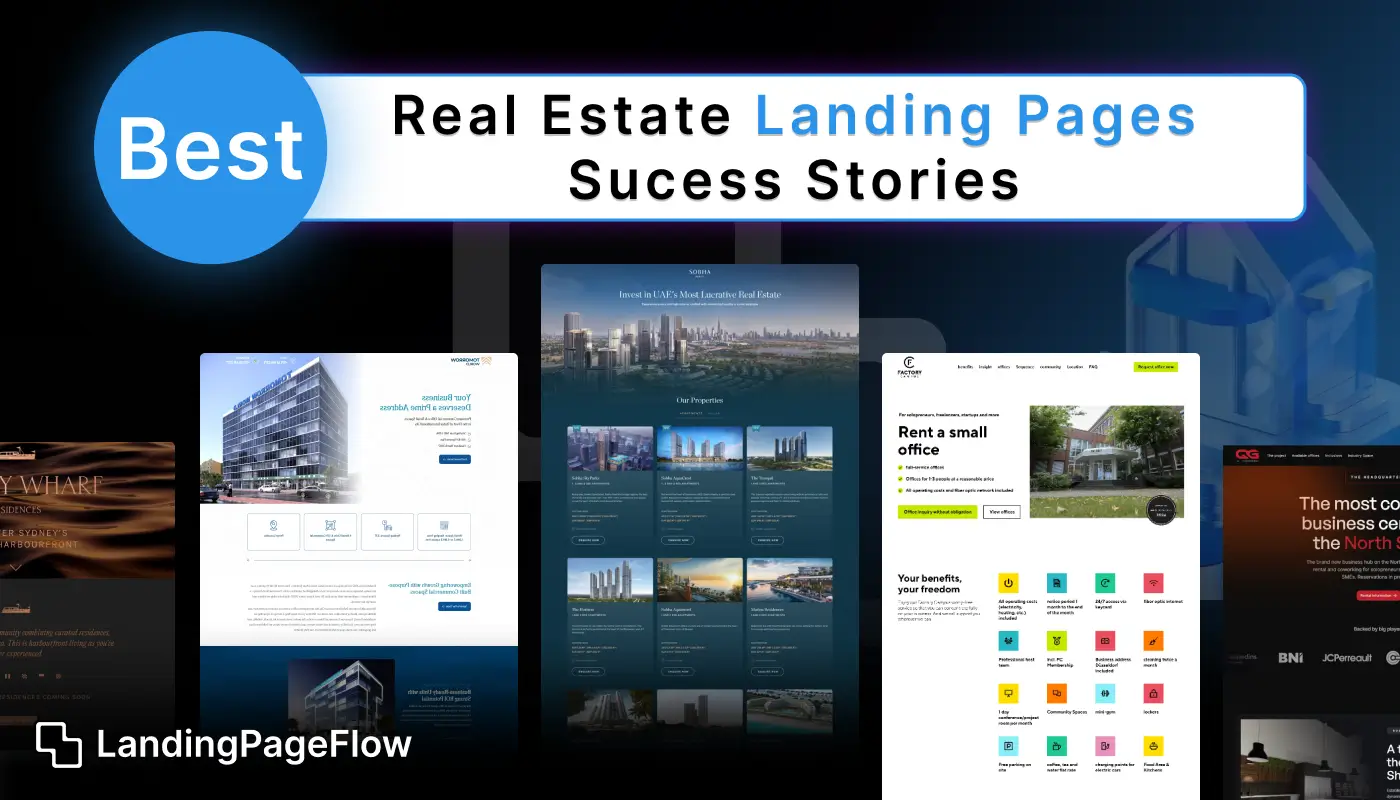
Successful real estate landing pages do more than showcase properties, and they guide visitors toward taking action.
By combining strategic layouts, persuasive copy, and high-quality visuals, these pages build trust and encourage potential buyers to engage.
In this guide, we’ll explore real estate landing page success stories from 2026, highlighting design patterns, copywriting techniques, and features that deliver results.
You’ll see how agents, developers, and property marketers use tailored sections like neighborhood highlights, virtual tours, and lead capture forms to maximize engagement.
These examples prove that the right combination of visuals, structure, and calls-to-action can turn casual browsers into serious inquiries.
"Need help creating a property-focused landing page that works?
Get a detailed review & step-by-step guidance to boost inquiries."
Table of Contents
- Introduction
- Why Real Estate Landing Pages Matter?
- Real Estate Landing Page Success Stories
- Case Study 1: Luxury Condos Campaign
- Case Study 2: Family Homes for Sale
- Case Study 3: Vacation Rental Sign-Ups
- Best Practices For High-Converting Real Estate Landing Pages
- Essential Elements of Real Estate Landing Pages
1. Introduction

With the rising popularity of digital marketing in real estate, landing pages have become essential.
A landing page can serve as a focused place to promote specific listings, highlight services, or capture visitor information.
By optimizing landing pages, real estate professionals can convert more of their website traffic into leads, providing a high return on marketing investment.
2. Why Real Estate Landing Pages Matter?

Real estate landing pages streamline the customer’s journey by reducing distractions and guiding users toward a specific action.
Whether it's booking a tour, signing up for property alerts, or reaching out to an agent, well-crafted landing pages can effectively capture the visitor’s intent and encourage conversions.
These pages also enable marketers to target particular demographics or neighborhoods, adding relevance and specificity to each campaign.
3. Real Estate Landing Page Success Stories

Case Study 1: Luxury Condos Campaign
Challenge: A high-end real estate agency wanted to drive interest in a new luxury condo project but faced competition from multiple developers.
Solution: The agency created a landing page with high-resolution visuals showcasing the interiors and amenities of the condos. The page included a form for early-bird sign-ups, and visitors who registered received exclusive details before the official launch.
Outcome: This page drove a significant number of leads, with a 45% conversion rate. By using scarcity tactics, like “Limited units available,” and leveraging exclusivity, the campaign attracted luxury buyers who valued early access.
Case Study 2: Family Homes for Sale
Challenge: A real estate company wanted to promote family-friendly homes but needed a way to target young families effectively.
Solution: They developed a dedicated landing page highlighting the family-friendly aspects of their listings, such as nearby schools, parks, and recreational facilities. The page used testimonials from families who had already moved into the neighborhood, adding social proof.
Outcome: The page saw a 30% increase in engagement, and families spent 20% more time on the page than on generic property listings. By speaking directly to family values, the page created a deeper connection with the target audience.
Case Study 3: Vacation Rental Sign-Ups
Challenge: A property management company wanted to boost its vacation rental bookings during the off-season.
Solution: The company created a landing page targeting weekend travelers with a “Weekend Getaway” campaign. The page offered special discounts for early bookings, a calendar of available dates, and images of popular nearby attractions.
Outcome: The campaign saw a 40% increase in bookings for the off-season. By focusing on the specific desires of weekend travelers, the landing page successfully converted interest into action.
4. Best Practices For High-Converting Real Estate Landing Pages

To emulate these success stories, consider implementing the following best practices in your real estate landing pages:
A. Visual Appeal and High-Quality Images
Images of properties, interiors, and surrounding areas make a significant impact on visitors. Use professional, high-resolution images to showcase the best aspects of your property.
B. Clear and Compelling Call-to-Action (CTA)
Make your CTA concise and action-oriented. CTAs like “Schedule a Viewing,” “Get Early Access,” or “See Floor Plans” can prompt users to take the next step.
C. Social Proof and Testimonials
Including testimonials from past clients or residents can establish credibility and make potential buyers feel more comfortable. Reviews and case studies can provide that essential trust factor.
D. Highlight Unique Selling Points (USPs)
If a property has unique features—like eco-friendly design, luxury amenities, or proximity to popular schools—highlight them early on the page.
E. Contact Forms for Lead Generation
Include a simple contact form with fields like name, email, and phone number. Offer value in return, such as a property brochure, market report, or exclusive updates.
F. Mobile Optimization
Ensure that your landing page is mobile-friendly. Many users will access your site on a mobile device, and a seamless experience can greatly affect conversion rates.
G. Fast Load Times
Optimize images and content for fast loading. Slow-loading pages often have high bounce rates, which can reduce lead generation opportunities.
5. Essential Elements of Real Estate Landing Pages

- Hero Section with Property Images: The first impression matters. A well-designed hero section with captivating visuals is essential.
- Compelling Headline: A headline that captures attention can set the tone for the rest of the page.
- Lead-Capture Form: Make it easy for potential leads to contact you by including a simple form.
- Property Details and USPs: Highlight property features, neighborhood information, and nearby amenities.
- Social Proof: Testimonials, reviews, or badges from platforms like Zillow or Realtor.com can increase trust.
- Interactive Map: An interactive map can show the location of the property and nearby amenities, which is especially useful for out-of-town buyers.
- Clear CTA Button: Every landing page should have a prominent, high-contrast button encouraging the user to take action.
Conclusion
Real estate landing pages that convert share a common formula: clear messaging, engaging visuals, and frictionless navigation.
By applying the proven strategies and design ideas from these success stories, you can create pages that inspire trust and drive qualified leads.
Focus on fast load times, responsive design, and a well-placed call-to-action to make your landing page a reliable asset for your real estate business.
The examples here are more than inspiration, and they’re practical blueprints for building high-performing real estate landing pages in 2026.
Now is the time to refine your design and content so every visitor leaves with a reason to take the next step.

FAQ
1. Why are real estate landing pages important?
They focus on converting visitors into leads by showcasing properties and making it easy to inquire or schedule viewings.
2. What makes a real estate landing page effective?
High-quality property images, compelling descriptions, trust elements, and a clear call-to-action.
3. Should I include property search on my landing page?
It can help if your goal is to offer multiple listings, but keep it simple for single-property pages.
4. How can I improve loading speed for property images?
Use optimized JPEG/WEBP formats, lazy loading, and compression tools.
5. What’s the best call-to-action for real estate pages?
Options include “Book a Viewing,” “Request More Info,” or “Get Property Alerts.”
6. Can I integrate video tours into my landing page?
Yes, embedding short virtual tours can significantly increase engagement and trust.


.webp)


