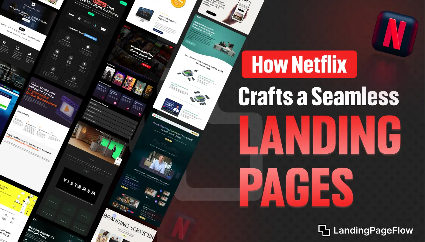
Netflix has become more than a streaming giant; it has mastered the art of creating seamless digital journeys.
Each landing page reflects a careful blend of storytelling and clarity. Design plays a crucial role in making visitors stay, reducing friction, and encouraging immediate action.
Every visual and word is intentional, guiding users naturally toward subscriptions. A brand’s landing page serves as the first impression, and Netflix ensures that this impression is compelling.
The emphasis is on speed, responsiveness, and emotional impact.
In 2026, Netflix demonstrates how innovation in design translates into measurable conversions. The brand’s ability to simplify complex offerings into a single action keeps it ahead. Attention is given to mobile experiences as well, ensuring consistency across screens.
Seamless navigation paired with personalized messaging strengthens engagement. Netflix proves that combining psychology, design, and data can turn landing pages into powerful growth engines.
"Curious how to elevate digital journeys?
Secure your free expert guide & build pages that truly deliver conversions."
Table of Contents
- Clear and Compelling Headline
- Visual Appeal and Brand Consistency
- Minimalism and Focused Content
- Easy and Encouraging Sign-Up Process
- Trust Signals and Social Proof
- Mobile-First Optimization
- Continuous Testing and Personalization
1. Clear and Compelling Headline

The very first element you encounter on Netflix’s landing page is a headline that leaves no ambiguity.
In 2026, Netflix continues to use a headline like “Unlimited movies, TV shows, and more. Watch anywhere. Cancel anytime.”
This headline is both clear and appealing, as it highlights the value of the service and answers potential questions about flexibility and commitment.
Netflix also employs a supporting subheadline or sentence that emphasizes accessibility and convenience.
This strategic use of language reassures users that they can watch from anywhere without restrictions, a vital component for today’s global and mobile audience.
2. Visual Appeal and Brand Consistency

Netflix’s landing page maintains a sleek, dark color scheme, reinforcing its brand image as a cinematic and entertainment-centric platform.
High-resolution, captivating images of popular movies and shows serve as the background, while vibrant red accents for buttons create a visually compelling contrast.
In 2026, Netflix’s landing page will embrace a clean, minimalist design that aligns with its branding across all devices.
Netflix leverages well-known show thumbnails and minimal text to create a visually engaging yet uncluttered experience.
The images are carefully chosen to appeal to diverse audiences, featuring popular titles across various genres to ensure that a broad range of visitors feel represented and intrigued.
3. Minimalism and Focused Content

Netflix has mastered the art of minimalism, with a landing page that features only the essential information required to inspire action.
The language is simple, concise, and focused entirely on benefits. Unlike other platforms that might overload a landing page with various options, Netflix maintains one clear path: signing up.
The landing page avoids extraneous details, opting instead to provide a few select highlights and letting the content speak for itself.
The primary goal is crystal-clear to the user, with no distractions like navigation menus or unnecessary links. This focused approach improves conversion rates, as users are only a few clicks away from subscribing.
4. Easy and Encouraging Sign-Up Process

Netflix’s streamlined sign-up process in 2026 is a lesson in simplicity. The CTA button, often labeled “Get Started,” stands out in red and is strategically placed above the fold, ensuring it’s one of the first elements users see.
Once clicked, the page transitions seamlessly into the sign-up flow without interrupting the user experience.
The process is segmented, with Netflix guiding users step-by-step, starting with entering their email address.
This segmented approach reduces friction and makes it feel less overwhelming than a long, single-page form. The copy around the form is designed to reassure users, reinforcing the ease of cancellation and flexible pricing.
5. Trust Signals and Social Proof

Trust is essential when converting visitors, and Netflix integrates trust signals effectively.
The landing page frequently reminds users that they can cancel anytime, reducing perceived risk and making it easier for hesitant visitors to subscribe.
In 2026, Netflix also subtly incorporates social proof by referencing the vast global user base and popular shows or movies trending on the platform.
Though not overtly displayed as testimonials or reviews, the presence of popular titles acts as social proof, reminding visitors of Netflix’s reputation as a reliable source of high-quality entertainment.
6. Mobile-First Optimization

Netflix prioritizes mobile users, and its landing page is meticulously optimized for mobile responsiveness.
The design adapts seamlessly to various screen sizes, with content, images, and buttons scaling accordingly to ensure an optimal experience on smartphones and tablets.
Netflix’s mobile landing page also uses touch-friendly elements and avoids large amounts of text.
The mobile CTA button remains prominent, making it easy for users to initiate the sign-up process with just a few taps. In 2026, Netflix's mobile-first approach is crucial, given that a large portion of its user base engages via mobile devices.
7. Continuous Testing and Personalization

Netflix’s data-driven approach involves constant testing and refinement of its landing page elements.
Through A/B testing, Netflix determines the most effective headlines, button colors, or even the sequence of the sign-up flow, ensuring the highest possible conversion rates.
In addition, Netflix personalizes its landing page based on factors such as the visitor’s location, viewing history (for returning users), and device.
For instance, someone visiting from a particular region might see content that’s popular locally, further enhancing engagement. This level of personalization keeps the experience relevant and engaging, which is essential in an era where users expect tailored content.
Conclusion
Landing pages are no longer just digital entry points; they have become conversion machines. Netflix highlights the importance of balancing creativity and performance in every design.
Businesses must recognize that clarity drives action, not clutter. Netflix’s strategy demonstrates how simplifying pathways increases user confidence and decision-making speed.
Conversions grow stronger when user expectations meet design precision. Netflix carefully removes distractions, ensuring that users know exactly what to do next.
Modern landing pages require agility, and Netflix sets this benchmark by updating and refining layouts to match evolving user behavior in 2026.
Growth depends on trust, and design can build that trust instantly. Netflix achieves this by delivering consistency, transparency, and seamless interaction across devices.

FAQ
1. Why are Netflix landing pages considered a benchmark in 2026?
Because they combine clarity, speed, and storytelling, Netflix’s landing pages keep users engaged and drive immediate conversions.
2. What makes Netflix’s landing page design different from others?
Netflix focuses on minimalism, strong visuals, and a single clear action, ensuring no distractions interrupt the user journey.
3. How does Netflix maintain consistency across devices?
By prioritizing mobile-first design, responsive layouts, and fast-loading visuals, Netflix ensures a seamless experience everywhere.
4. Can smaller businesses replicate Netflix’s landing page strategies?
Yes, any business can apply principles like simplicity, focus, and emotional design to improve their landing pages.
5. Why is speed so important in landing page performance?
Faster pages reduce bounce rates and keep visitors engaged, which directly increases conversion opportunities.
6. What lesson can marketers learn from Netflix’s landing pages?
Marketers should aim for clarity, build trust through design, and guide users to one primary action without unnecessary clutter.


.webp)


