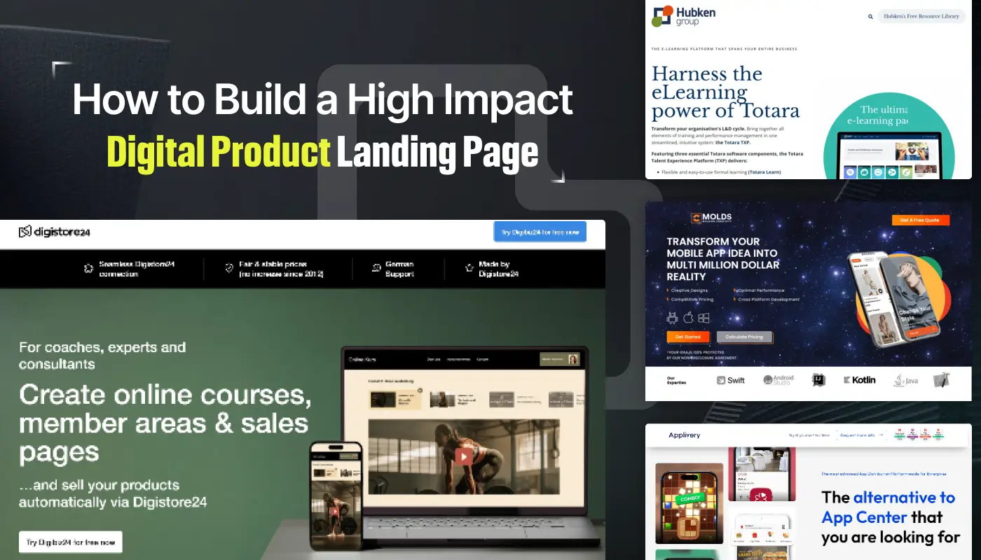
A digital product landing page is the first impression many customers will have of your offering. Clarity in messaging ensures visitors understand value immediately.
Eye-catching visuals and feature highlights grab attention and guide focus. Concise, compelling copy communicates benefits without overwhelming readers.
Strong calls-to-action prompt visitors to engage, subscribe, or purchase confidently. Responsive layouts make pages functional across desktops, tablets, and mobile devices.
Fast loading speeds and clean designs maintain interest and reduce drop-offs. Following these principles helps transform product information into a high-converting landing page experience.
"Need a high-performing landing page fast?
Access your free strategy guide."
Table of Contents
- What is a Digital Product Landing Page?
- Key Elements of a High-Impact Landing Page
- Best Practices For Design and Layout
- Crafting Compelling Content For Your Landing Page
- Optimizing For SEO and Search Rankings
- Mobile Optimization and Responsiveness
- Case Studies: Successful Digital Product Landing Pages
- Tools to Build a High-Impact Digital Product Landing Page
1. What is a Digital Product Landing Page?

A digital product landing page is a standalone web page specifically designed to showcase and promote a digital product—whether it’s software, an app, an eBook, or an online course.
Its main goal is to inform visitors, highlight key features, and convert them into paying customers.
Unlike regular web pages, a landing page focuses on a single call to action (CTA) and is designed with minimal distractions.
2. Key Elements of a High-Impact Landing Page

Clear and Concise Headline
Your headline is the first thing visitors see, so it must clearly state the value proposition of your digital product.
It should instantly communicate what your product is and how it will solve a problem for the visitor.
For example, “Revolutionize Your Workflows with Our Project Management App” is a straightforward, benefit-driven headline.
Engaging Visuals and Media
High-quality images, videos, or graphics can help visitors quickly grasp the core benefits of your product.
Consider adding product demos, screenshots, or a short explainer video to illustrate the functionality and appeal of your digital product.
Visual elements should align with your brand’s style and enhance the overall message.
Product Features and Benefits
Highlight the most important features of your digital product. Use short, bullet-point lists or icons to break down key features.
Focus on user benefits—how your product improves the user’s experience, solves a problem, or saves time and money.
Social Proof and Testimonials
Adding social proof, such as customer testimonials, ratings, or case studies, can significantly boost trust and credibility.
If your digital product has been endorsed by influencers, partners, or recognized brands, make sure to feature their logos and testimonials prominently on your landing page.
Strong Call to Action (CTA)
The CTA is the most crucial part of your landing page. Whether you want users to sign up, download, or purchase, your CTA should stand out visually.
Use action-oriented language like "Get Started Now," "Download the App," or "Try It for Free" to encourage immediate action.
Pricing and Payment Options
If your digital product has pricing plans, clearly display them in a transparent and easy-to-understand format.
Many successful digital product landing pages offer tiered pricing (Basic, Pro, Enterprise) to cater to different customer segments.
Highlight any special offers, free trials, or money-back guarantees to encourage conversions.
3. Best Practices For Design and Layout

Minimalist and Focused Design
Simplicity is key when designing a high-impact digital product landing page. Avoid clutter and unnecessary elements that distract users from the main goal.
Keep your design clean, with a minimalist layout that draws attention to the key selling points.
F-Shaped Layout for Content Flow
Most users read web pages in an F-shaped pattern, scanning the top, down the left side, and then across the page.
Place the most important information in these areas—your headline, product benefits, and CTA should appear in the "hot spots" where users' eyes naturally fall.
Consistent Branding
Ensure that your landing page design aligns with your overall brand identity. Consistent colors, fonts, and logo usage help build trust and establish a sense of professionalism. Branding consistency also helps users recognize and connect with your product more easily.
Use White Space Effectively
White space (or negative space) is an important design element that makes your content more readable and engaging. White space helps break up content, making the page feel less overwhelming and improving the overall user experience.
4. Crafting Compelling Content For Your Landing Page

Write with the User in Mind
Your landing page copy should focus on the user’s pain points and how your digital product addresses them.
Speak directly to your target audience and use language that resonates with their needs.
For example, instead of saying "Our software has advanced algorithms," frame it as "Our software saves you hours of manual work with intelligent automation."
Benefits Over Features
While it’s important to mention your product’s features, emphasize the benefits those features bring to the user.
Users care more about how the product will improve their lives, not the technical details behind it.
Use Action-Oriented Language
To encourage conversions, your copy should be actionable and persuasive. Phrases like "Boost your productivity today" or "Unlock exclusive features" motivate users to take the next step.
5. Optimizing For SEO and Search Rankings

Relevant Keywords
Integrate relevant keywords into your page’s title, headlines, and meta descriptions.
This will help your landing page rank higher on search engines like Google. Ensure that your keywords are naturally incorporated and don't detract from the user experience.
Meta Descriptions
Write compelling meta descriptions that encourage users to click on your link in search results.
Your meta description should include the primary keyword and a strong call to action, such as "Discover the best project management app for teams—Sign up for a free trial today."
Fast Loading Speed
Website performance affects both user experience and SEO. Optimize your images and minimize JavaScript to ensure your page loads quickly.
According to studies, a delay of even one second can lead to a significant drop in conversions.
6. Mobile Optimization and Responsiveness

Responsive Design
With the majority of users accessing websites on mobile devices, having a responsive design is essential. Make sure your digital product landing page adapts seamlessly to different screen sizes and provides an optimal viewing experience on mobile, tablets, and desktops.
Thumb-Friendly CTAs
On mobile, users rely heavily on their thumbs for navigation. Place your CTA buttons where they are easily accessible, such as near the bottom of the screen, and make them large enough to tap comfortably.
7. Case Studies: Successful Digital Product Landing Pages

Slack
Slack’s landing page is known for its clean design, engaging visuals, and clear messaging. The page highlights key features with short, benefit-driven descriptions and includes plenty of social proof with client logos and testimonials.
Shopify
Shopify uses bold visuals, a clear headline, and a strong call to action on their landing page. Their product demo video is strategically placed to explain the platform’s capabilities, while a simple pricing section encourages users to start a free trial.
Trello
Trello’s landing page focuses on the product’s ease of use and flexibility. Their CTA is front and center, with an immediate option to sign up for free. Visuals and simple copy reinforce the value of the tool without overwhelming the user with information.
8. Tools to Build a High-Impact Digital Product Landing Page

WordPress + Elementor
WordPress, combined with page builders like Elementor, makes it easy to create professional digital product landing pages without needing advanced coding skills.
Unbounce
Unbounce is a drag-and-drop platform specifically designed for building and optimizing landing pages. It’s ideal for testing different elements and layouts to maximize conversions.
Figma
For those who prefer custom designs, Figma allows you to create and prototype landing pages from scratch. You can easily collaborate with your team and clients in real-time.
Conclusion
High-impact landing pages help users grasp product value quickly and encourage action. Well-structured layouts guide visitors through features, benefits, and trust signals.
Persuasive copy and clear visuals improve engagement and reduce hesitation. Consistent design and brand elements strengthen credibility and recognition.
Mobile-friendly and optimized pages ensure accessibility for every visitor. Regular testing and adjustments refine performance and maximize conversions over time.
Implementing these strategies empowers businesses to showcase digital products successfully while driving measurable results.

FAQ
1. Why is a digital product landing page important?
It introduces your product, communicates value clearly, and drives conversions efficiently.
2. How long should a product landing page be?
Keep it concise enough for easy scanning but detailed enough to highlight features and benefits.
3. What elements boost engagement on landing pages?
Visuals, clear copy, trust signals, interactive demos, and strong calls-to-action.
4. Can a landing page work on mobile devices?
Yes, responsive design ensures usability and readability across smartphones and tablets.
5. How can I increase sign-ups or purchases?
Include persuasive messaging, simple forms, and prominent calls-to-action above the fold.
6. Should I A/B test my landing page?
Absolutely. Testing different layouts, copy, and visuals identifies what converts best.


.webp)


