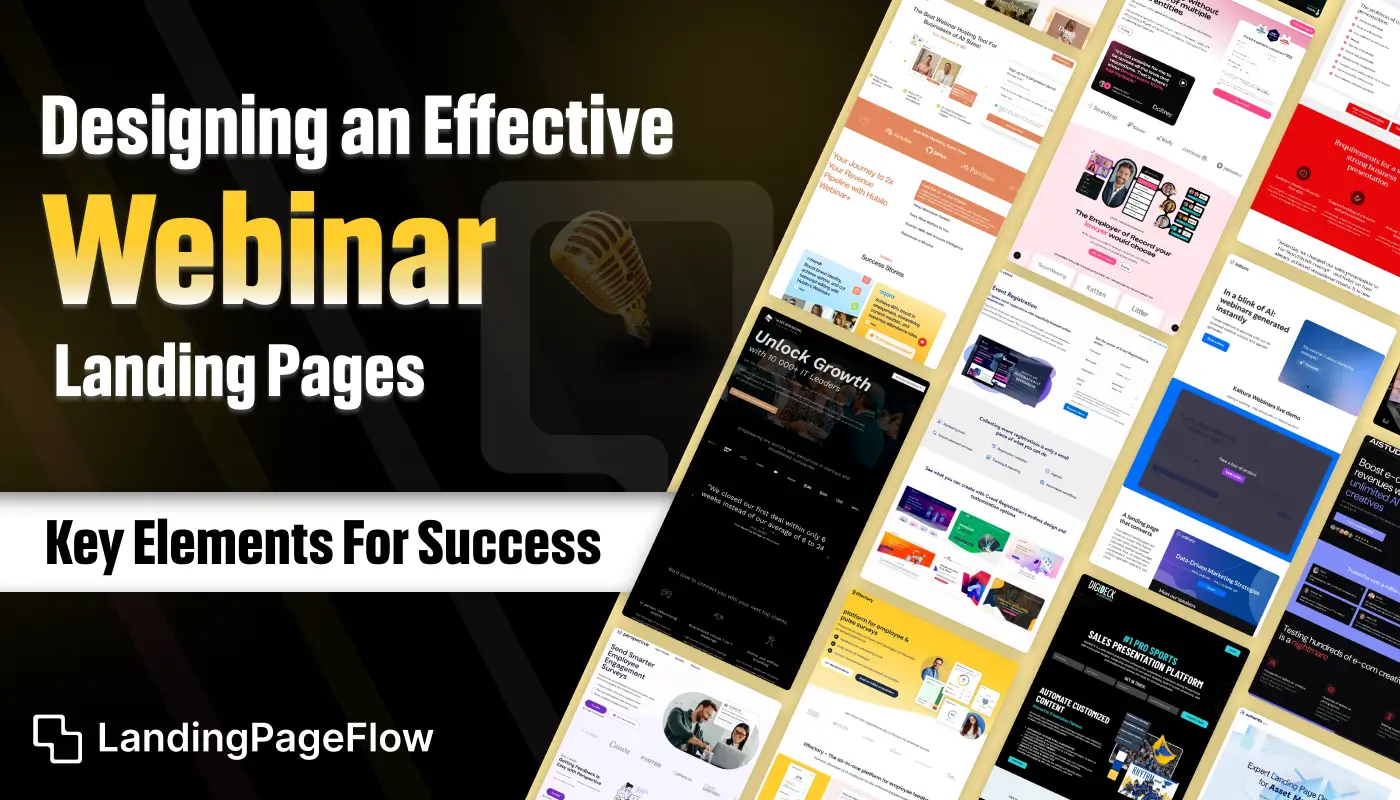
Creating a webinar landing page that converts requires more than just an appealing headline and a sign-up button. Visitors need to feel an immediate connection to the event’s value and relevance.
A focused structure, compelling visuals, and concise messaging work together to keep visitors engaged from the moment they land. Clear calls-to-action encourage faster decision-making and minimize drop-offs.
Showcasing essential details like date, time, speaker credentials, and benefits helps build trust and interest. Incorporating social proof such as testimonials or previous attendee feedback adds credibility.
Strong visual hierarchy ensures important elements stand out without overwhelming the viewer. Thoughtful placement of form fields can also improve completion rates.
Every design choice should serve one goal: encouraging registrations. A well-crafted webinar landing page can make the difference between a full virtual room and an under-attended event.
"Want to host a packed online event?
Claim your free design strategy guide & launch your webinar."
Table of Contents
- Understanding the Purpose of a Webinar Landing Page
- Key Elements of a Webinar Landing Page
- Compelling Headline
- Engaging Webinar Description
- Clear and Persuasive Call-to-Action (CTA)
- Speaker Information
- Registration Form
- Trust Signals and Social Proof
- Design Best Practices
- Visual Appeal and Branding
- Mobile Optimization
- Page Load Speed
- Tips For Boosting Registrations
- Create Urgency and Scarcity
- Offer Incentives
- Use Social Sharing Features
- Real-Life Examples of Successful Webinar Landing Pages
1. Understanding the Purpose of a Webinar Landing Page

A webinar landing page’s primary goal is to capture registrations and provide potential attendees with all the information they need to decide to sign up.
It should convey the value of attending the webinar, outline the benefits, and make the registration process as seamless as possible.
An effective landing page not only attracts visitors but also convinces them to take action.
2. Key Elements of a Webinar Landing Page

Compelling Headline
The headline is the first thing visitors will see, so it needs to grab their attention immediately.
It should clearly state what the webinar is about and why it’s valuable. Use action-oriented language and highlight the main benefit or unique selling point of the webinar.
Engaging Webinar Description
The description should provide a detailed overview of the webinar content, including what topics will be covered, who will be speaking, and what attendees can expect to learn.
Be concise but informative, and focus on the benefits of attending. Use bullet points or short paragraphs to make the content easily scannable.
Clear and Persuasive Call-to-Action (CTA)
The CTA button should be prominent and use compelling language to encourage users to register.
Phrases like “Register Now,” “Save Your Spot,” or “Join Us Live” can be effective. Ensure the CTA stands out visually and is placed in a location that is easily accessible to visitors.
Speaker Information
Highlighting the credentials and experience of the speakers can significantly increase the credibility of your webinar.
Include a brief bio and photo of each speaker, and emphasize their expertise and relevance to the webinar topic. This builds trust and encourages potential attendees to register.
Registration Form
The registration form should be simple and user-friendly. Only ask for essential information such as name and email address to avoid discouraging sign-ups.
Consider adding a checkbox for users to receive updates or promotional emails, but keep the form as streamlined as possible.
Trust Signals and Social Proof
Incorporate elements that build trust and credibility, such as testimonials from past webinar attendees, logos of reputable companies, or endorsements from industry experts.
Social proof can reassure potential registrants that the webinar is worth their time.
3. Design Best Practices

Visual Appeal and Branding
Ensure that your landing page is visually appealing and consistent with your brand’s style.
Use colors, fonts, and images that align with your brand identity. The design should enhance the content and make the page inviting and engaging.
Mobile Optimization
A significant portion of web traffic comes from mobile devices, so your landing page must be mobile-friendly.
Test the design on various devices to ensure it looks and functions well on different screen sizes. A responsive design will adapt to different devices and provide a seamless experience for all users.
Page Load Speed
Page load speed can impact user experience and conversion rates. Optimize images and minimize the use of heavy scripts to ensure fast loading times.
A slow page can lead to higher bounce rates and lower registration numbers.
4. Tips For Boosting Registrations

Create Urgency and Scarcity
Encourage immediate action by creating a sense of urgency. Use countdown timers, limited-time offers, or mention limited availability to prompt visitors to register sooner rather than later.
Offer Incentives
Providing incentives such as exclusive content, free resources, or entry into a giveaway can make your webinar more appealing. Highlight these incentives on the landing page to attract more registrations.
Use Social Sharing Features
Include social sharing buttons on your landing page to allow visitors to easily share the webinar with their network. This can increase visibility and attract additional registrants through word-of-mouth marketing.
5. Real-Life Examples of Successful Webinar Landing Pages

Example 1: HubSpot
HubSpot’s webinar landing page effectively uses a clear headline, engaging description, and strong CTA. It features speaker information and testimonials to build credibility and encourage sign-ups.
Example 2: Neil Patel
Neil Patel’s landing page for his webinars is visually appealing and well-branded. It highlights key topics, and speaker expertise, and provides a straightforward registration form, making it easy for visitors to sign up.
Example 3: Moz
Moz’s webinar landing page uses compelling visuals, a detailed description, and an attention-grabbing CTA. It also includes social proof and information about the webinar’s value, making it a strong example of a successful landing page.
Conclusion
A successful webinar landing page blends strategic design, persuasive content, and clear calls-to-action to capture maximum registrations. The experience should be seamless, making it easy for visitors to commit without hesitation.
By prioritizing clarity, relevance, and engagement, you position your event as valuable and worth attending. Mobile responsiveness ensures no audience segment is left behind.
Integrating visuals, proof of expertise, and minimal distractions strengthens the conversion pathway. A streamlined process builds trust and encourages faster action.
When executed correctly, the design does more than inform, and it inspires commitment. The right layout, messaging, and features can set the tone for a memorable and impactful event.

FAQ
1. What is a webinar landing page?
A webinar landing page is a dedicated webpage designed to promote a webinar and encourage visitors to register by highlighting its key details and benefits.
2. Why is design important for a webinar landing page?
Good design improves user experience, guides attention to key elements, and increases the chances of visitors completing the registration form.
3. What should be included on a webinar landing page?
Essential elements include the event title, date and time, speaker information, benefits, a registration form, and a clear call-to-action.
4. How can I increase conversions on my webinar landing page?
Use concise copy, engaging visuals, social proof, and strategic placement of sign-up forms to encourage visitors to register.
5. Should a webinar landing page be mobile-friendly?
Yes, a mobile-responsive design ensures visitors on all devices can register easily, increasing your potential audience reach.
6. How early should I publish my webinar landing page?
Ideally, launch it 3–4 weeks before the event to allow enough time for promotion and audience registration.


.webp)


