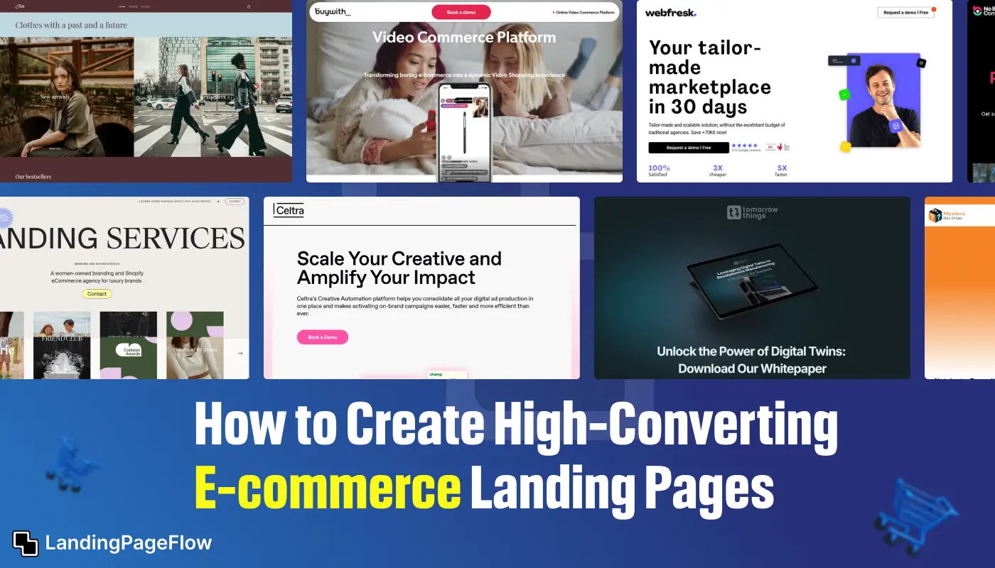
Ecommerce success starts with a landing page built to sell. Instead of overwhelming visitors with too many distractions, a focused ecommerce landing page guides them toward a single purchasing decision.
In this guide, you’ll see examples and strategies for crafting landing pages that blend persuasive product presentation with clear, compelling calls-to-action.
We’ll explore ways to highlight benefits, incorporate social proof, and use design elements that inspire trust and urgency.
From product launches to seasonal promotions, these techniques can help you create landing pages that not only attract visitors but also convert them into paying customers.
By applying these proven principles, you can make your ecommerce landing pages a powerful driver of sales growth.
"Not sure why your product pages aren’t converting?
Claim your free audit & discover quick-win fixes."
Table of Contents
- Understanding the Role of Ecommerce Landing Pages
- Essential Elements of a High-Converting Ecommerce Landing Page
- Best Practices For Designing Your Ecommerce Landing Page
- Real-World Examples of Successful Ecommerce Landing Pages
- Tips For A/B Testing and Analyzing Your Landing Page Performance
1. Understanding the Role of Ecommerce Landing Pages

Ecommerce landing pages serve as the first impression for potential customers and play a vital role in guiding them toward making a purchase.
Unlike general website pages, ecommerce landing pages are designed with a singular focus: to convert visitors into buyers.
By understanding the specific objectives of your landing page, you can tailor its design and content to effectively drive conversions.
2. Essential Elements of a High-Converting Ecommerce Landing Page

1. Compelling Headline and Subheadline
Your headline should immediately capture the visitor's attention and communicate the value of your product or offer.
Pair it with a persuasive subheadline to provide additional details and entice users to learn more.
2. High-Quality Product Images and Videos
Visuals are crucial in ecommerce. Use high-resolution images and engaging videos to showcase your product from multiple angles and demonstrate its features.
This helps visitors get a clear understanding of what they’re purchasing.
3. Clear Call-to-Action (CTA)
A well-crafted CTA is essential for guiding visitors toward the desired action, whether it's making a purchase, signing up for a newsletter, or downloading a guide.
Ensure your CTA stands out and uses action-oriented language.
4. Customer Reviews and Testimonials
Social proof can significantly influence purchasing decisions. Include genuine customer reviews and testimonials to build trust and credibility.
Highlight positive feedback and showcase real customer experiences with your product.
5. Benefit-Oriented Copy
Focus on the benefits of your product rather than just its features. Explain how your product solves a problem or improves the customer’s life.
Use clear and concise language to communicate these benefits effectively.
6. Limited-Time Offers and Promotions
Create a sense of urgency with limited-time offers, discounts, or special promotions.
This can encourage visitors to act quickly and make a purchase before the offer expires.
7. Optimized Forms and Checkout Process
Simplify the form and checkout process to reduce friction and minimize cart abandonment. Ensure that forms are easy to fill out and that the checkout process is straightforward and secure.
3. Best Practices For Designing Your Ecommerce Landing Page

1. Keep It Simple and Focused
Avoid clutter and distractions on your landing page. Focus on a single goal and design your page to support that goal. This clarity helps guide visitors toward taking the desired action.
2. Use High-Contrast Colors
High-contrast colors can make your CTA buttons and key information stand out. Ensure that the color scheme of your landing page is visually appealing and enhances readability.
3. Ensure Mobile Responsiveness
With a significant number of users shopping on mobile devices, it's crucial to ensure that your landing page is mobile-friendly. Optimize your page for various screen sizes and test its performance on different devices.
4. Incorporate Trust Signals
Display trust signals such as security badges, money-back guarantees, and secure payment icons to reassure visitors that their personal and payment information is safe.
5. Test Different Layouts and Designs
Experiment with different layouts, designs, and content placements to find what works best for your audience. Use A/B testing to compare variations and determine which elements drive the highest conversion rates.
4. Real-World Examples of Successful Ecommerce Landing Pages

Example 1: Shopify’s “Build a Business” Contest Landing Pag
Shopify’s landing page for their “Build a Business” contest effectively uses a clear headline, engaging visuals, and a straightforward CTA to drive entries. The page highlights the benefits of participating and provides an easy-to-follow form for submissions.
Example 2: Casper’s Mattress Landing Page
Casper’s landing page for their mattress product features high-quality images, customer testimonials, and a compelling CTA. The page effectively communicates the benefits of the mattress and uses social proof to build trust.
Example 3: Warby Parker’s Glasses Landing Page
Warby Parker’s landing page for their glasses offers an easy-to-navigate layout with clear CTAs and an engaging product quiz. The page emphasizes the brand’s unique selling points and simplifies the shopping experience.
5. Tips For A/B Testing and Analyzing Your Landing Page Performance

1. Define Clear Objectives
Before starting A/B testing, define clear objectives for what you want to achieve. Whether it’s increasing click-through rates, improving conversion rates, or reducing cart abandonment, having specific goals will guide your testing process.
2. Test One Element at a Time
Focus on testing one element at a time to accurately measure its impact on performance. This could be the CTA button color, headline wording, or image placement. Testing multiple elements simultaneously can make it difficult to determine what is driving changes in performance.
3. Use Analytics Tools
Leverage analytics tools to track and measure key metrics such as conversion rates, bounce rates, and user behavior. Analyze the data to identify patterns and insights that can inform your optimization strategies.
4. Continuously Iterate and Optimize
Optimization is an ongoing process. Continuously iterate on your landing page based on test results and performance data. Regularly review and update your page to ensure it remains effective and aligned with your business goals.
Conclusion
Driving more sales is easier when your ecommerce landing page is built around one clear objective.
By pairing strong visuals with persuasive copy and a seamless buying process, you create an experience that makes customers feel confident purchasing.
Optimize load speed, ensure mobile responsiveness, and keep navigation simple to prevent drop-offs.
The tips and examples in this guide will help you design a page that not only looks appealing but also delivers measurable conversion results.
Start building ecommerce landing pages today that transform clicks into repeat customers.

FAQ
1. Why should ecommerce stores use dedicated landing pages?
They allow you to focus on a single offer or product without distractions, increasing the chance of a sale.
2. How can I make my ecommerce landing page more persuasive?
Highlight key benefits, use high-quality product images, and include social proof like reviews or testimonials.
3. Should I include discounts or promotions on my landing page?
Yes, limited-time offers can create urgency and encourage faster buying decisions.
4. How do I ensure my ecommerce landing page is mobile-friendly?
Use responsive layouts, larger tap targets, and compressed images for faster load times.
5. What should I put above the fold on an ecommerce landing page?
Product image, headline, price, and a clear call-to-action button.
6. Can I use video on my ecommerce landing page?
Absolutely, a short product demo video can boost engagement and conversions.


.webp)


