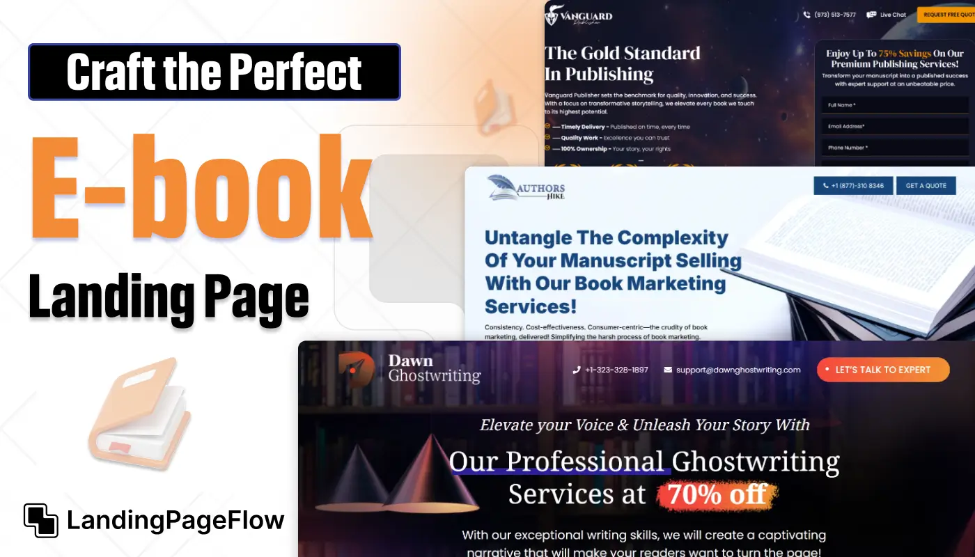
Capturing reader interest in seconds can make or break your e-book’s success. A thoughtfully designed landing page acts as your most persuasive sales tool.
Each element should build trust and spark curiosity. Many authors underestimate how much design impacts conversions, losing potential readers before they even scroll.
A strong landing page showcases your e-book’s value through engaging headlines, compelling imagery, and a clear call-to-action. Strategic placement of testimonials, reviews, and benefits can significantly improve engagement and download rates.
An uncluttered design ensures visitors focus on your message rather than distractions. Clear, benefit-driven copy keeps them reading.
Optimizing your page for mobile ensures your message reaches audiences on every device.
"Ready to launch your e-book with impact?
Claim your free landing page checklist."
Table of Contents
- Understanding the Importance of a Well-Designed E-book Landing Page
- Step 1: Define Your Goal and Target Audience
- Step 2: Choose a Compelling Headline
- Step 3: Craft Persuasive and Clear Content
- Writing an Engaging Introduction
- Highlighting Key Benefits
- Creating an Irresistible Call-to-Action (CTA)
- Step 4: Design Tips For a Visually Appealing Page
- Using Eye-Catching Visuals
- Ensuring Mobile Responsiveness
- Step 5: Implementing Trust Signals and Social Proof
- Step 6: Optimize For SEO and Performance
1. Understanding the Importance of a Well-Designed E-book Landing Page

Your e-book landing page is more than just a simple web page—it's a crucial touchpoint in your marketing funnel.
A well-designed landing page can capture attention, build trust, and convince visitors to take action.
It should be focused, visually appealing, and optimized for conversions. By following the steps outlined in this guide, you'll be able to create a landing page that effectively showcases your e-book and entices visitors to download or purchase it.
2. Step 1: Define Your Goal and Target Audience

Before you start designing your landing page, it’s essential to have a clear understanding of your goal.
Are you trying to grow your email list, generate leads, or sell your e-book directly? Knowing your objective will help guide the design and content of your page.
Additionally, define your target audience—who are they, what are their pain points, and how can your e-book solve their problems? Tailoring your landing page to the specific needs and interests of your audience will increase its effectiveness.
3. Step 2: Choose a Compelling Headline

The headline is the first thing visitors see when they land on your page, and it needs to grab their attention immediately.
Your headline should be clear, concise, and focused on the main benefits of your e-book.
It should answer the question, “What’s in it for me?” For example, instead of simply stating the title of your e-book, you could say, “Unlock the Secrets to Financial Freedom with Our Free E-book.”
4. Step 3: Craft Persuasive and Clear Content

Writing an Engaging Introduction
The introduction should briefly explain what your e-book is about and why it’s valuable.
Keep it concise—just enough to pique the reader's interest. Explain how your e-book addresses a specific problem or provides valuable insights that the reader needs.
Use persuasive language that speaks directly to your audience’s needs and desires.
Highlighting Key Benefits
Instead of just listing features, focus on the benefits of your e-book.
How will it help the reader? Will it save them time, money, or effort? Will it provide them with new knowledge or skills? Use bullet points to make the benefits easy to scan, and include any unique selling points that set your e-book apart from others.
Creating an Irresistible Call-to-Action (CTA)
Your CTA is arguably the most important element on your landing page. It should be direct and compelling, guiding the visitor to take the next step.
Phrases like “Download Now,” “Get Your Free Copy,” or “Start Learning Today” are clear and action-oriented.
Make sure your CTA button stands out visually—use contrasting colors, larger fonts, and strategic placement to ensure it catches the eye.
5. Step 4: Design Tips For a Visually Appealing Page

Using Eye-Catching Visuals
Visuals are a powerful way to enhance your landing page and draw attention to your content.
Include a high-quality image of your e-book cover, along with any relevant graphics or illustrations that support your message.
Visuals should be aligned with your brand’s aesthetic and contribute to a cohesive, professional look.
Ensuring Mobile Responsiveness
With more users accessing websites on mobile devices, your landing page must be fully responsive.
Test your page on various devices to ensure that all elements—text, images, buttons—display correctly and are easy to interact with.
A mobile-friendly design not only improves user experience but also boosts your conversion rates.
6. Step 5: Implementing Trust Signals and Social Proof

Trust signals and social proof can significantly impact the credibility of your landing page.
Include testimonials from readers who have benefited from your e-book, or showcase reviews and ratings if your e-book has been previously published.
You can also add logos of media outlets or brands that have featured or endorsed your e-book.
These elements help build trust and reassure visitors that they’re making a smart decision by downloading or purchasing your e-book.
7. Step 6: Optimize For SEO and Performance

A high-converting landing page isn’t just about design and content—it also needs to be optimized for search engines and fast load times.
Use relevant keywords in your headline, meta descriptions, and body content to improve your page’s visibility in search results.
Compress images and minify CSS and JavaScript to reduce load times, ensuring that your page is as fast and responsive as possible.
Conclusion
An effective e-book landing page is more than just attractive, it’s a conversion engine. Every component should work toward inspiring a single action. Clear messaging combined with a persuasive visual flow can dramatically boost your results.
Well-placed calls-to-action guide readers seamlessly. Attention to detail helps create a smooth and professional visitor experience, increasing trust in your brand.
Understanding your target audience allows you to tailor both content and design for maximum impact. Testing variations of headlines, visuals, and button placements can lead to consistent performance gains.
Consistency in style ensures your landing page aligns with your overall brand identity. When designed strategically, your page becomes a powerful lead-generation tool for your e-book.

FAQ
1. What makes an e-book landing page effective?
A clear headline, strong visuals, persuasive copy, and a focused call-to-action work together to guide visitors toward downloading your e-book.
2. How important is mobile optimization for my landing page?
Extremely important. Many visitors browse on phones, so ensuring mobile-friendly design helps retain and convert those users.
3. Should I include reviews or testimonials?
Yes, social proof builds trust and increases the likelihood of readers downloading your e-book.
4. How many calls-to-action should I include?
Typically 2–3, placed strategically without overwhelming the visitor, is enough to drive conversions.
5. What is the ideal length for landing page copy?
It should be long enough to explain your e-book’s value but concise enough to maintain reader attention.
6. How can I test my landing page’s performance?
Use A/B testing for headlines, visuals, and CTA placements to see what resonates best with your audience.


.png)


