A powerful landing page can change the way people interact with your brand. It acts as the first impression that guides a visitor toward making a choice. Strong visuals create instant emotional impact while carefully written copy builds trust and interest.
The best designs keep attention focused on a single goal, making it easier for visitors to take the next step. Clear direction always translates into results. Modern businesses understand that landing pages are more than just design.
They are strategic assets that combine psychology, usability, and style. Storytelling also plays a role in creating emotional connections. A thoughtful blend of images, colors, and copy drives meaningful engagement.
Smart design creates a path from interest to action. Companies that master this approach consistently outperform competitors in digital marketing results.
"Looking for proven landing page tactics?
Grab your free expert strategy guide now & start designing for results."
Table of Contents
- The Importance of Landing Page Design
- Key Elements For an Action-Inspiring Landing Page
- Examples of Creative Landing Page Designs
- Design Strategies For Maximizing Conversions
- Best Practices For Mobile-Friendly Landing Pages
1. The Importance of Landing Page Design

The first impression users have of your business often comes from your landing page. This is where they learn about your offer and decide whether to engage further.
An aesthetically pleasing landing page can hold attention, but to inspire action, it needs to also be functional and intuitive.
Impact of Good Design:
- Builds Trust: A well-designed page signals professionalism and credibility.
- Enhances Usability: Simple navigation and clear CTAs ensure that visitors know exactly what steps to take next.
- Improves Conversion Rates: A visually appealing yet conversion-focused design can significantly boost user engagement and sales.
A study by Unbounce found that nearly 44% of businesses see a lift in conversions with improved landing page design. Therefore, prioritizing creative and strategic design can directly impact your bottom line.
2. Key Elements For an Action-Inspiring Landing Page

A landing page is more than just images and text; it’s a finely tuned machine designed to lead visitors toward a specific goal.
Below are the key components that, when aligned, can make your landing page both inspiring and effective.
1. Headline
Your headline is the first thing visitors notice. It needs to immediately convey the benefit of your offer concisely and compellingly. A good headline focuses on what the user stands to gain, such as solving a problem or achieving a goal.
2. Call to Action (CTA)
The CTA is the most critical part of your landing page. Whether it’s a button that says “Sign Up” or “Buy Now,” the CTA must be clearly visible and direct. Use action-oriented language that tells users exactly what to do.
Examples of Effective CTAs:
- “Start Your Free Trial”
- “Get My Discount Now”
- “Join Today and Save”
3. Visuals
People are visual creatures, and the right imagery can make or break your landing page.
Use high-quality images or videos that support your message and convey the value of your offer. Visuals should be clear and relevant, not just decorative.
4. Social Proof
Adding testimonials, reviews, or client logos can establish trust. These elements serve as validation from other users and can help remove hesitation from potential customers.
Key Social Proof Elements:
- Customer Testimonials
- Case Studies
- User Reviews (e.g., star ratings)
5. Persuasive Copy
Your landing page copy should be concise but powerful. Use it to explain the benefits of your product or service, address pain points, and reassure visitors that their decision to engage is the right one.
6. Simple Form
If your landing page includes a sign-up form, make sure it’s as short as possible. The fewer fields a user has to fill out, the more likely they are to complete the form.
3. Examples of Creative Landing Page Designs

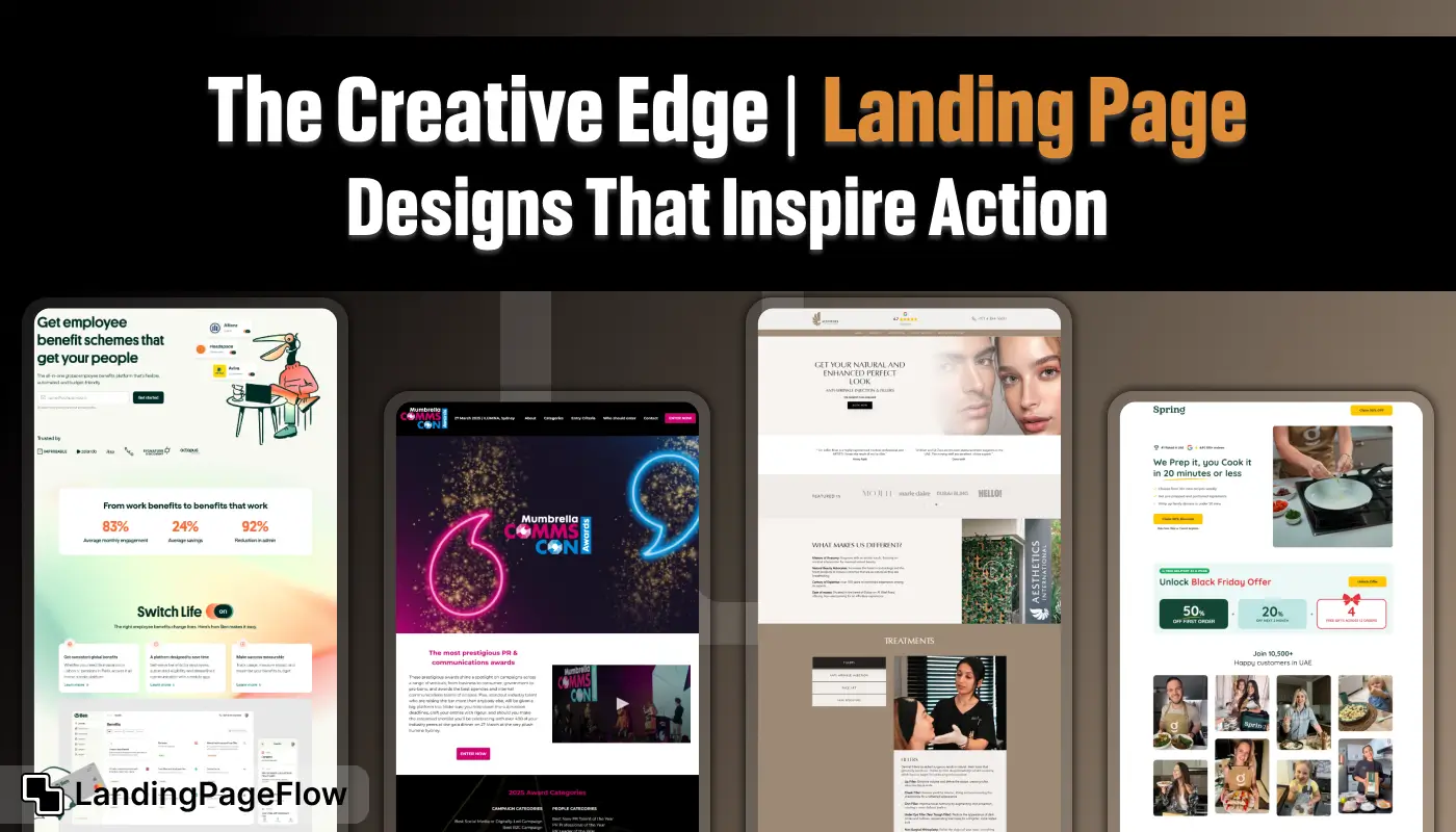
Here are a few inspiring landing pages that balance creativity with functionality, driving engagement and conversions.
1. Airbnb
Airbnb’s landing pages focus on simplicity and visuals. Using large images of potential stays and a clear search bar, they immediately capture the user's attention. The CTA is prominent and easy to understand.
2. Dropbox
Dropbox is known for its clean, minimalist design. Their landing page highlights the product’s benefits with a simple headline and clear CTA, emphasizing ease of use and accessibility.
3. Trello
Trello’s landing page is visually engaging with a bold, colorful design that showcases its features. The page provides plenty of white space, making it easy to focus on the CTA, “Get Started – It’s Free.”
4. Squarespace
Squarespace’s landing page is a model of visual hierarchy, using high-quality images to inspire users. The page focuses on the product’s capabilities, with a clear CTA encouraging visitors to start a free trial.
4. Design Strategies For Maximizing Conversions

The following strategies can help you create a landing page that not only inspires action but maximizes conversions:
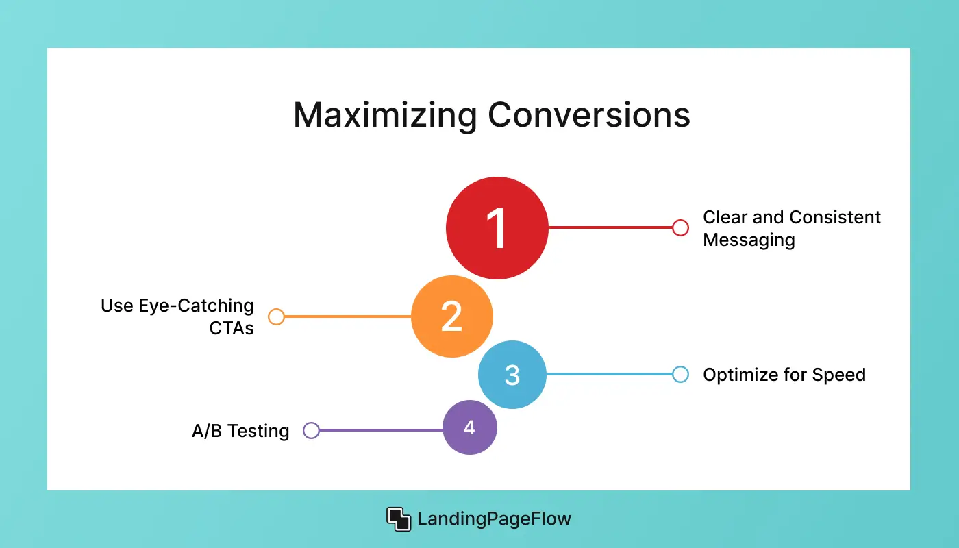
1. Clear and Consistent Messaging
Your messaging should be consistent from the first ad or social post that drives visitors to your landing page, all the way through to the final CTA. This consistency reinforces your offer and prevents confusion.
2. Use Eye-Catching CTAs
Your CTA buttons should stand out. Use contrasting colors and larger fonts to draw attention to them. The placement of the CTA is also crucial—ensure it’s above the fold so users see it without having to scroll.
3. Optimize for Speed
Fast-loading landing pages reduce bounce rates and improve user satisfaction. Compress images and use fast hosting services to ensure your page loads quickly.
4. A/B Testing
One of the best ways to optimize your landing page is through A/B testing. Test different versions of headlines, CTA copy, and layouts to see what resonates best with your audience.
5. Best Practices For Mobile-Friendly Landing Pages

With mobile traffic accounting for nearly half of all web visitors, optimizing your landing page for mobile is essential. A well-designed mobile landing page should be easy to navigate and quick to load.
Key Tips:
- Responsive Design: Ensure your landing page automatically adjusts to different screen sizes.
- Fast Load Time: Use compressed images and minimal scripts for faster performance.
- Thumb-Friendly CTAs: Place buttons where they are easily clickable on mobile screens.
Conclusion
Landing pages remain the bridge between interest and action. Their design determines how effectively a visitor will engage, trust, and convert into a customer. Strong calls-to-action lead people confidently toward results.
Clear design leaves little room for confusion and keeps focus where it matters most. Businesses that dedicate resources to testing layouts often gain an advantage. Refinement allows better performance over time, ensuring higher impact.
Consistency in branding strengthens user confidence and establishes a lasting connection. Trust is often the missing piece in underperforming campaigns. The value of great design lies in its ability to deliver measurable growth.
Investing in creativity and clarity creates long-term benefits. Each page becomes a strategic asset rather than just a temporary campaign tool.

FAQ
1. What makes a landing page design inspiring?
An inspiring landing page combines clear messaging, engaging visuals, and a focused call-to-action that motivates visitors to take the next step.
2. How does design influence conversion rates?
Good design reduces distractions and highlights the desired action, making it easier for users to decide, which leads to higher conversion rates.
3. Are single-goal landing pages more effective?
Yes, focusing on one goal eliminates confusion and increases the likelihood that visitors will complete the intended action.
4. How important is mobile design for landing pages?
Mobile-friendly landing pages are essential since most users browse on phones. Responsive layouts ensure every visitor has a smooth experience.
5. Should landing pages include long or short content?
The ideal length depends on your goal and audience. Short pages work for simple actions, while longer content is better for complex decisions.
6. How often should landing page designs be updated?
Refreshing designs regularly keeps your brand current and allows you to optimize based on user behavior, improving performance over time.


.png)


