A strong landing page is more than just a digital storefront; it acts as the decisive moment for potential customers to either move forward or leave.
Strategically placed call-to-actions provide a natural path for visitors, leading them closer to conversions without overwhelming them. Crafting a narrative that resonates with their intent makes the page both memorable and persuasive.
Trust-building elements like testimonials, guarantees, and social proof can strengthen credibility instantly. At the same time, layout consistency keeps attention where it matters most.
Balancing creativity with usability ensures that your landing page looks appealing while staying practical for the user. Simple tweaks like font hierarchy, color schemes, and spacing add polish that captures attention.
By approaching the design in a structured manner, businesses can create pages that attract, inform, and convert. Taking time to refine details ultimately results in stronger performance and measurable impact.
"Ready to boost conversions?
Get your free landing page strategy guide & start building smarter."
Table of Contents
- Understanding the Importance of Landing Pages
- Essential Elements of a High-Converting Landing Page
- Step-by-Step Guide to Building a Great Landing Page
- Step 1: Define Your Goal and Audience
- Step 2: Craft an Irresistible Headline
- Step 3: Write Persuasive, Concise Copy
- Step 4: Use Compelling Visuals
- Step 5: Optimize Your CTA
- Step 6: Use Trust Signals and Social Proof
- Step 7: Design for Mobile Responsiveness
- Tips For Testing and Improving Your Landing Page
1. Understanding the Importance of Landing Pages
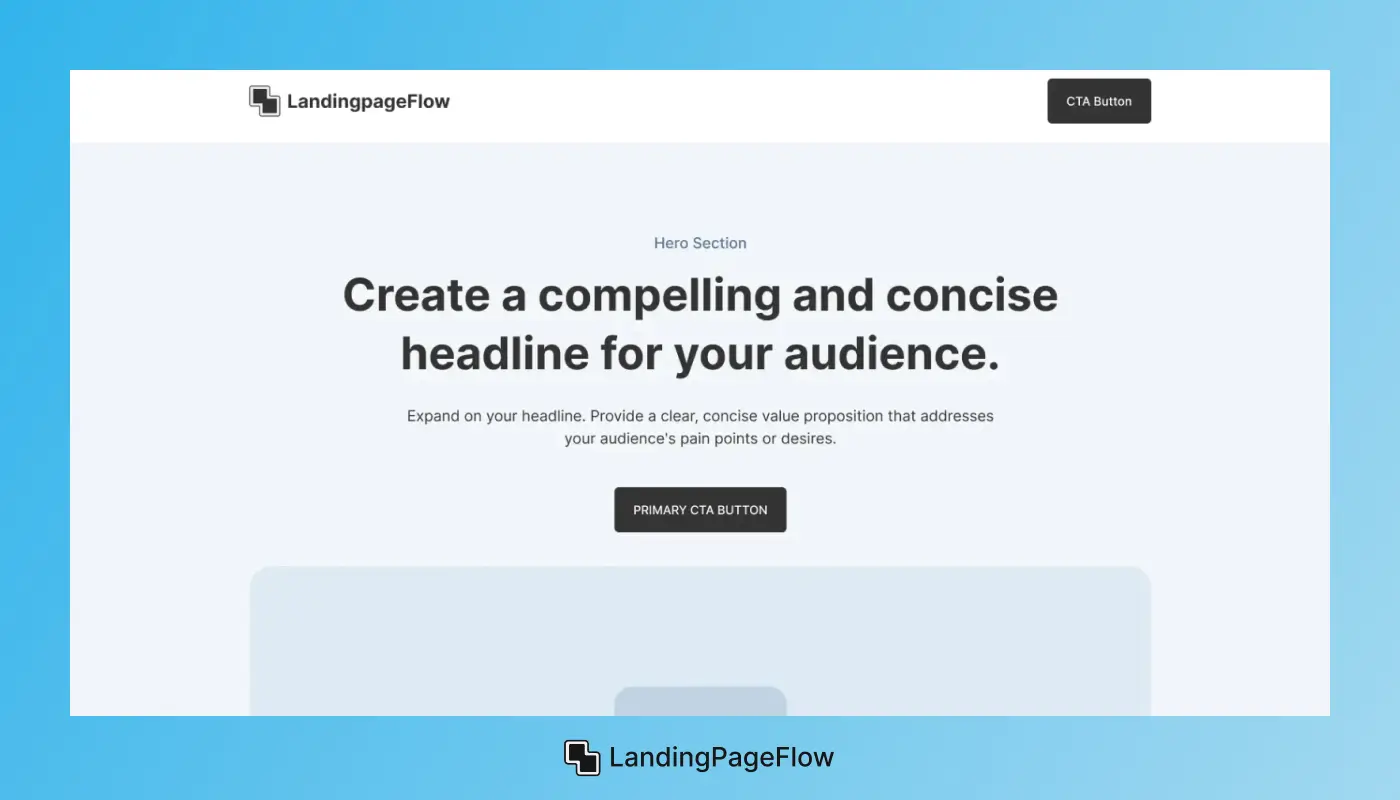
A landing page serves as a digital storefront, often acting as the first point of contact between your business and potential customers.
Its primary purpose is to convert visitors by encouraging them to take a specific action, whether that's signing up for a newsletter, downloading an e-book, purchasing a product, or registering for a webinar.
The effectiveness of a landing page can be measured through conversion rates— the percentage of visitors who complete the desired action.
Research shows that businesses using optimized landing pages can see conversion rates of 5-15% or higher, depending on their industry and target audience.
A well-designed landing page creates a streamlined user experience, making it easy for visitors to understand your offer and take action.
This focused approach minimizes distractions, as landing pages typically have no navigation links, thus directing visitors’ attention solely to the conversion goal.
2. Essential Elements of a High-Converting Landing Page
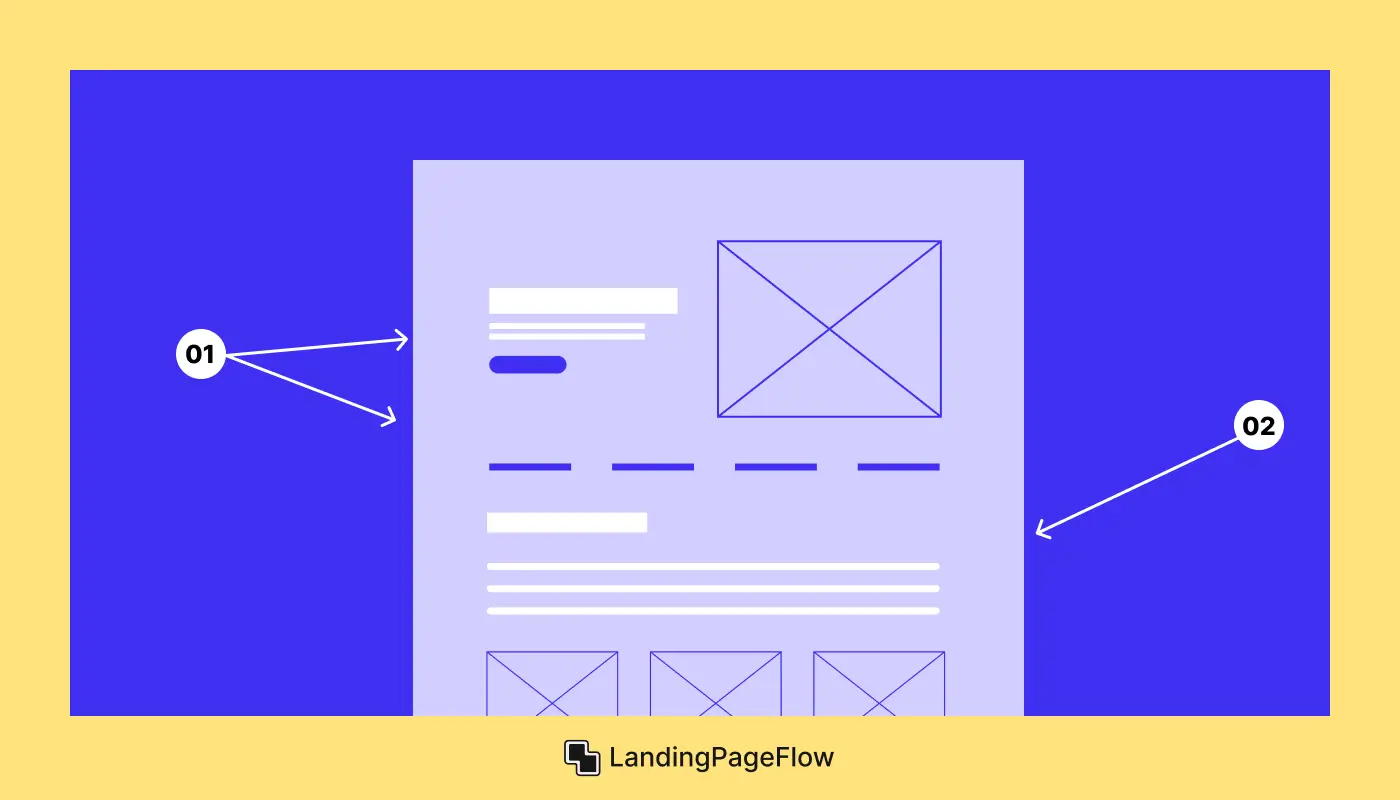
When creating a landing page, it's crucial to incorporate several key elements to maximize its effectiveness:
- Clear Headline: The headline is often the first text a visitor sees, so it must be impactful. It should immediately convey the main benefit or value proposition of the offer.
- Concise Copy: The body text should provide enough information to inform the reader about the offer without overwhelming them. Aim for clarity and brevity.
- Compelling Visuals: High-quality images or videos can enhance the user experience, making the page more engaging. Visuals should support the content and not distract from it.
- Strong Call-to-Action (CTA): The CTA button is the focal point of the landing page, guiding visitors toward the desired action. It should be visually distinct and use action-oriented language.
- Trust Signals: Elements such as testimonials, customer reviews, case studies, and trust badges can establish credibility and trustworthiness, encouraging visitors to convert.
- Mobile Optimization: With a significant percentage of users accessing landing pages via mobile devices, ensuring the design is responsive and mobile-friendly is critical.
3. Step-by-Step Guide to Building a Great Landing Page
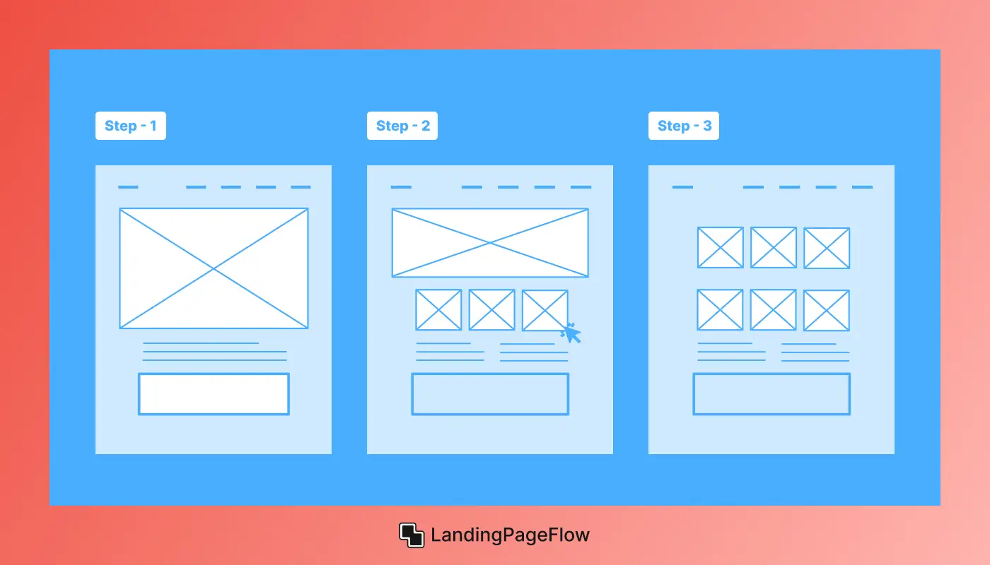
Step 1: Define Your Goal and Audience
The first step in creating a landing page is to define its primary goal. What action do you want visitors to take? Common goals include:
- Capturing email addresses for a newsletter.
- Driving sales for a specific product.
- Encouraging sign-ups for a webinar or event.
- Promoting a free trial for a service.
Once you've established your goal, it’s crucial to identify your target audience. Understand their demographics, interests, and pain points. This insight will inform your messaging and design choices, ensuring they resonate with your audience.
Step 2: Craft an Irresistible Headline
The headline is critical in grabbing attention. It should be compelling and communicate the value of your offer. Here are some tips for crafting effective headlines:
- Use Numbers: Headlines with numbers often perform better, as they promise concrete value. For example, “5 Tips to Boost Your Productivity” is more enticing than “Tips to Boost Your Productivity.”
- Ask a Question: Engaging questions can pique curiosity. For instance, “Are You Tired of Wasting Time on Unproductive Meetings?” addresses a common pain point.
- Highlight Benefits: Focus on what the visitor will gain. For example, “Transform Your Life with Our Comprehensive Fitness Program” emphasizes the positive outcome.
Step 3: Write Persuasive, Concise Copy
The body copy should provide clear information about the offer while keeping the reader engaged. Here are some best practices:
- Keep It Short: Visitors typically skim content, so use short paragraphs and bullet points to make the text easily scannable.
- Focus on Benefits: Rather than simply listing features, explain how these features will benefit the user. For example, instead of saying “Our software has a user-friendly interface,” say “Easily navigate our software and save time with its intuitive interface.”
- Use Active Language: Action verbs create a sense of urgency and encourage visitors to take action. Phrases like “Get started today” or “Claim your offer now” motivate immediate responses.
Step 4: Use Compelling Visuals
Visuals play a significant role in engaging visitors. High-quality images or videos can complement your copy and convey your message effectively.
- Relevant Imagery: Use images that reflect your brand and resonate with your audience. If you’re selling a product, show it in action or demonstrate its use.
- Infographics and Diagrams: If applicable, use infographics to visually present data or processes, making complex information more digestible.
- Videos: Short promotional or explainer videos can be highly effective in conveying your message quickly and engagingly.
Step 5: Optimize Your Call-to-Action (CTA)
The CTA is arguably the most critical element on your landing page. A strong CTA encourages visitors to take action. Here’s how to create an effective CTA:
- Be Specific: Clearly state what action you want the visitor to take. Instead of a generic “Submit,” use “Download Your Free E-Book Now” to convey value.
- Use Action-Oriented Language: Verbs such as “Get,” “Claim,” “Join,” or “Start” prompt visitors to act.
- Make It Stand Out: Use contrasting colors for your CTA button to ensure it stands out from the rest of the page. Position it prominently, ideally above the fold and multiple times throughout the page.
Step 6: Use Trust Signals and Social Proof
Trust signals are essential for reducing hesitation and encouraging conversions. Here are some effective ways to incorporate trust signals into your landing page:
- Testimonials: Include quotes from satisfied customers that highlight the value of your product or service.
- Case Studies: Provide brief case studies showcasing how your product or service has helped others.
- Trust Badges: Display any relevant certifications, affiliations, or security badges to reassure visitors about their safety and privacy.
Step 7: Design for Mobile Responsiveness
With the increasing use of mobile devices for browsing, ensuring your landing page is mobile-friendly is vital. Here’s how to design for mobile responsiveness:
- Use Responsive Design: Make sure your landing page adapts to different screen sizes by using responsive design principles.
- Optimize Load Times: Mobile users are often on the go, so fast loading times are critical. Optimize images and minimize code to ensure quick loading.
- Test on Multiple Devices: Regularly test your landing page on various mobile devices to ensure functionality and user experience.
4. Tips For Testing and Improving Your Landing Page
Once your landing page is live, the work doesn’t stop. Continuous testing and improvement are essential to maximizing conversions. Here are some effective strategies:
- A/B Testing: Conduct A/B tests to compare different versions of your landing page. Experiment with elements like headlines, images, copy, and CTA buttons to see what resonates best with your audience.
- Analyze User Behavior: Use tools like heatmaps or user session recordings to analyze how visitors interact with your landing page. This insight can reveal which areas are effective and which may need adjustments.
- Solicit Feedback: Reach out to your audience for feedback on your landing page. Use surveys or direct questions to gather insights on their experiences.
- Regularly Update Content: Keep your landing page fresh by updating content regularly. This not only enhances SEO but also keeps returning visitors engaged.
Conclusion
An effective landing page is not built on guesswork but on structured planning and clear execution. Each section works together to guide visitors toward action. Strong design enhances usability while targeted copy ensures the message speaks directly to the audience.
Adding trust signals, highlighting benefits, and removing unnecessary friction can dramatically improve conversions. Pages that focus on customer needs while minimizing distractions achieve greater results.
Consistency across devices is equally important, as mobile visitors expect the same smooth experience as desktop users. Clear navigation, responsive design, and fast loading times support this goal.
When a landing page is crafted carefully, it not only captures attention but also builds lasting trust. Businesses that treat landing pages as powerful conversion tools consistently see growth.

FAQ
1. Why is a landing page important for conversions?
A landing page focuses on a single offer or message, minimizing distractions and guiding users toward a clear call-to-action. This focused approach increases conversions.
2. What elements should every landing page include?
Key elements include a strong headline, persuasive copy, trust signals, visuals, and a clear call-to-action. Together, they create a compelling user journey.
3. How do I design a landing page that looks attractive?
Use clean layouts, balanced color schemes, clear typography, and purposeful visuals. An uncluttered design improves readability and user experience.
4. What role does mobile responsiveness play in landing page design?
Mobile responsiveness ensures that users have a seamless experience across devices, which is essential since most visitors now browse through smartphones.
5. How can I test if my landing page is effective?
A/B testing headlines, copy, visuals, and call-to-actions can show which variations perform best. Tracking analytics reveals where improvements are needed.
6. Should I use multiple landing pages for different campaigns?
Yes, multiple landing pages tailored to specific audiences or offers allow more personalized messaging, improving engagement and conversion rates.



.webp)
