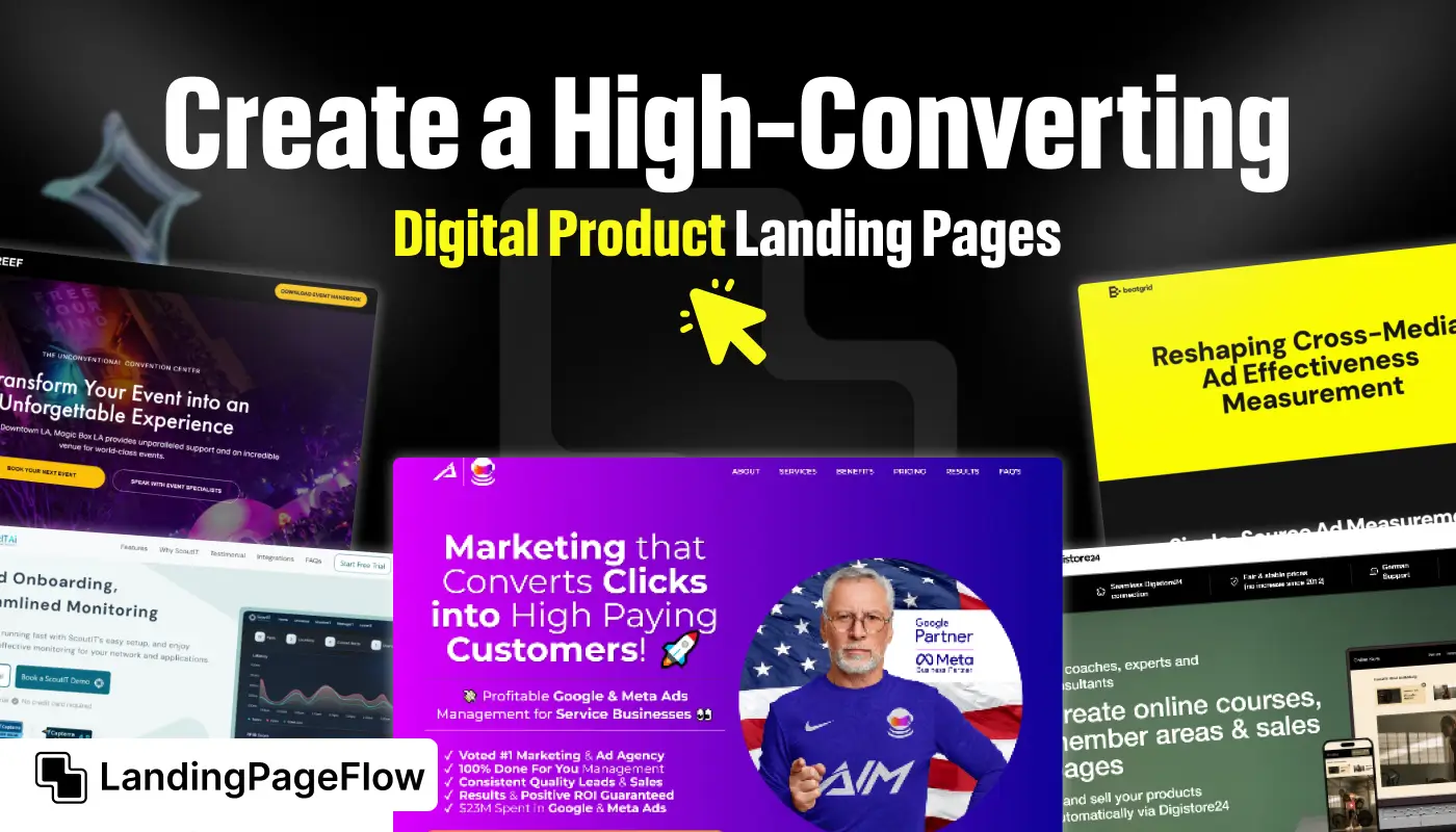
Strong landing pages are the backbone of digital product sales. They work as the first impression for visitors, often deciding if a user will stay or leave. Clarity in messaging makes a big difference when presenting your offer.
People want to quickly understand what your product does and why it matters. A strong value proposition builds trust and encourages users to take action.
Visitors often need reassurance before committing to a purchase online. Compelling calls-to-action placed strategically can increase conversions dramatically. Users respond well when guided through an effortless journey.
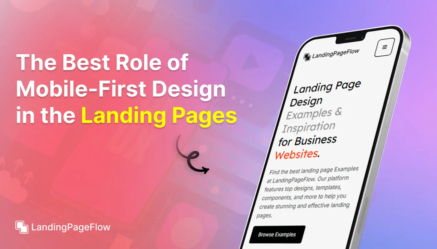
Mobile responsiveness is non-negotiable since many visitors browse on smaller screens. A page that adapts beautifully retains user attention longer.
Small details like typography, button design, and page speed directly affect results. Every second counts when capturing or losing potential buyers.
"Not sure how to make your digital product stand out?
Claim your free expert strategy guide now."
Table of Contents
- Why Digital Product Landing Pages Matter
- Key Elements of a High-Converting Landing Page
- Step-by-Step Guide to Building a Digital Product Landing Page
- Best Practices to Maximize Conversions
- Real-World Examples of Effective Digital Product Landing Pages
1. Why Digital Product Landing Pages Matter

Landing pages are crucial for digital product sales as they help convert traffic into paying customers.
When someone clicks on your ad, email, or social media link, a landing page is often their first impression of your product.
A well-crafted landing page can be the difference between a visitor leaving immediately or converting into a customer.
Reasons to Focus on Your Landing Page:
- First Impressions Matter: Your landing page should immediately grab attention and communicate the value of your digital product.
- Tailored Messaging: Unlike a general website, a landing page is focused on a single purpose or product, making it easier to guide visitors toward a specific action.
- Optimized Conversions: An effective landing page employs conversion rate optimization (CRO) techniques to ensure visitors become customers.
2. Key Elements of a High-Converting Landing Page

When designing a landing page, several elements contribute to its effectiveness. Here’s what you need to include:
Compelling Headline
The headline is the first thing a visitor sees. It should be clear, and concise, and communicate the primary benefit of your digital product.
Make sure it grabs attention and speaks to a problem your target audience wants to solve.
Subheadline that Adds Value
While the headline captures attention, the subheadline can go deeper into explaining the value or unique selling points (USPs) of your product.
It provides clarity and encourages the visitor to continue exploring the page.
Visual Content (Images and Videos)
Images and videos help illustrate the benefits of your digital product and demonstrate its use.
A demo video showing how the product works can significantly boost engagement and conversions.
Clear Call-to-Action (CTA)
Your CTA should stand out and clearly state what action you want the visitor to take (e.g., "Download Now," "Get Started," or "Sign Up Today"). It should be strategically placed throughout the page.
Social Proof (Testimonials, Reviews, and Ratings)
People trust peer reviews and feedback. Adding customer testimonials, case studies, or ratings can increase credibility and reassure visitors that your product delivers results.
Benefits-Oriented Copy
Explain the benefits your digital product provides, not just its features. Focus on how the product solves a problem or makes the customer's life easier.
Simple and Intuitive Design
A cluttered layout can distract visitors. Keep the design clean, intuitive, and focused on driving the visitor towards the CTA. Avoid overwhelming visitors with too much information.
3. Step-by-Step Guide to Building a Digital Product Landing Page

Here’s a step-by-step process for crafting an effective landing page:
Step 1: Define Your Audience and Goal
Start by identifying your target audience and understanding their needs. What problem does your digital product solve? Establish the primary goal of the landing page, such as generating sales or capturing leads.
Step 2: Write a Compelling Headline
Create a headline that captures attention and speaks directly to the visitor's needs. For example, if you’re selling an e-book on productivity, the headline could be "Boost Your Productivity with Our Proven 7-Step Guide."
Step 3: Use Engaging Visuals
Include images, illustrations, or videos that showcase the digital product in action. Make sure the visuals are high-quality and relevant to the product.
Step 4: Add a Strong Call-to-Action
The CTA should be strategically placed above the fold and repeated throughout the page, especially after major sections. Use action-oriented language and consider using contrasting colors to make the button stand out.
Step 5: Provide Social Proof
Add customer testimonials, ratings, or even logos of companies that have used your product. This reassures visitors and builds trust.
Step 6: Optimize for SEO
Incorporate relevant keywords, meta tags, and descriptions to make the landing page discoverable through search engines.
Step 7: Test and Iterate
Use A/B testing to experiment with different headlines, CTAs, and images. Analyze user behavior to identify which elements are driving conversions and which need improvement.
4. Best Practices to Maximize Conversions

To get the most out of your landing page, follow these best practices:
Make the Page Mobile-Friendly
With a growing number of users accessing websites via mobile devices, ensuring a responsive design is crucial. The page should load quickly, and all elements should be easily accessible on smaller screens.
Limit Distractions
Eliminate unnecessary links, pop-ups, or navigation elements that could divert the visitor’s attention away from the primary CTA.
Emphasize Benefits Over Features
While it’s essential to include product features, focusing on benefits explains how the product improves the user's life. Use bullet points to highlight benefits in an easily digestible format.
Use Persuasive Copywriting Techniques
Incorporate techniques like scarcity ("Limited Time Offer") or urgency ("Get Started Now") to prompt immediate action.
Perform Regular CRO Audits
Continuously optimize the landing page based on analytics. Check for elements that can be improved or updated to increase conversion rates.
5. Real-world examples of Effective Digital Product Landing Pages

Looking for inspiration? Here are some digital product landing pages that excel in various aspects:
- Slack – Uses a minimalistic design, clear CTA, and concise benefits-oriented copy.
- Dropbox – Incorporates a simple layout with strong social proof and a clear value proposition.
- Grammarly – Leverages a compelling headline, testimonial-based social proof, and a prominent CTA.
- Canva – offers engaging visuals, an easy-to-understand interface, and clear action steps for visitors.
These examples demonstrate how different elements can be combined effectively to enhance user experience and drive conversions.
Conclusion
Digital product landing pages succeed when clarity, trust, and design align seamlessly. A page that communicates value instantly converts more effectively.
Conversion-focused design makes it easier for visitors to understand and act.
Elements like CTAs, visuals, and copy work together to create momentum. Seamless browsing experiences across devices improve retention and engagement. Responsive layouts help you reach a wider audience without losing quality.
Engaging visuals and persuasive headlines capture interest faster than plain text. The right balance of design and content keeps users exploring. Consistency in branding gives your product more authority in a crowded market.
Recognition and trust can help establish long-term customer loyalty. Focusing on small yet impactful improvements turns a landing page into a sales engine. Every optimization you make adds long-term value to your product.

FAQ
1. What makes a digital product landing page effective?
A digital product landing page is effective when it combines clear messaging, compelling visuals, trust elements, and strong calls-to-action that guide users.
2. How long should a landing page be for digital products?
A good landing page balances information and clarity. It should provide enough details to answer objections but remain concise to avoid overwhelming visitors.
3. Do I need social proof on my digital product landing page?
Yes, testimonials, case studies, and customer reviews help build trust. Social proof reassures potential buyers and boosts overall conversions.
4. How important is mobile optimization for landing pages?
Mobile optimization is essential. A large portion of traffic comes from mobile devices, and a poor experience can significantly reduce conversions.
5. What is the role of visuals in digital product landing pages?
Visuals enhance engagement and highlight the product’s benefits. They help users understand features quickly while creating a stronger emotional connection.
6. Can small design changes improve my landing page performance?
Absolutely. Even minor improvements in button design, copy clarity, or load speed can lead to noticeable increases in conversions over time.


.webp)


