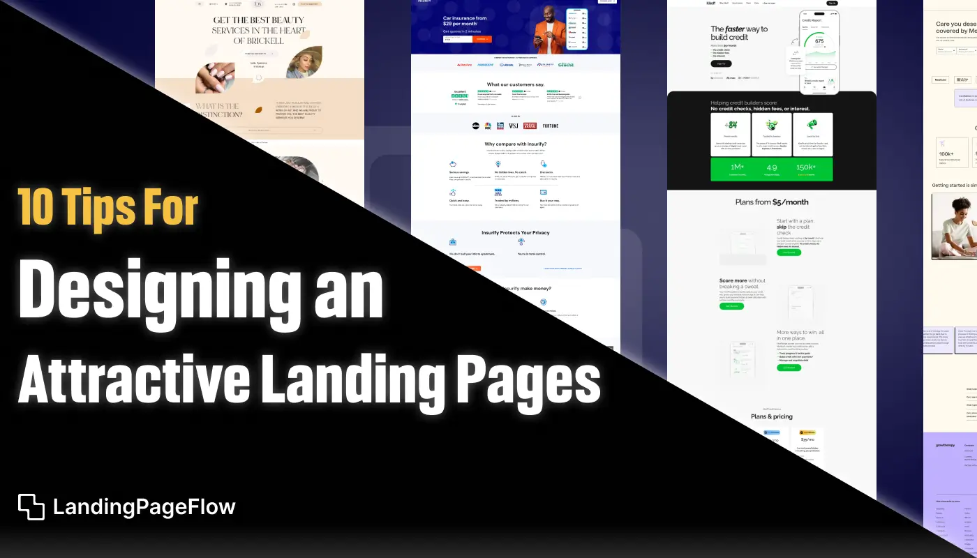
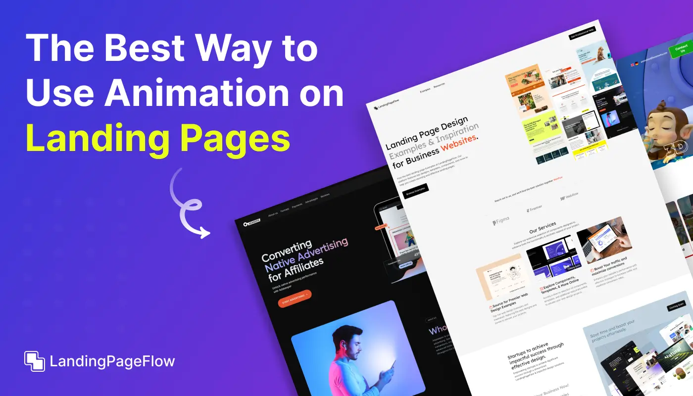
Creating a landing page that converts is not just about design; it is about understanding how people interact online. Visual appeal alone cannot guarantee results.
Strong headlines and clear calls to action guide visitors toward the next step, reducing hesitation. Adding trust elements such as testimonials or case studies increases credibility and reassures users they are making the right choice.
Page speed plays a major role, as slow-loading designs cause users to abandon before engaging. Simplicity in layout ensures the focus remains on the key offer, avoiding distractions.
Color psychology and typography choices subtly influence emotions, which helps direct attention toward conversion goals. Adding engaging visuals such as illustrations or product previews makes the experience more memorable.
A well-designed landing page not only attracts attention but also builds trust and drives measurable business growth.
"Ready to turn visitors into customers?
Grab your free landing page guide today - for higher conversions."
Table of Contents
- Understand Your Audience
- Create a Strong and Clear Headline
- Focus on Clean and Simple Design
- Use High-Quality Visuals
- Optimize For Mobile Responsiveness
- Include a Clear Call-to-Action (CTA)
- Build Trust with Social Proof
- Keep Forms Short and Simple
- Use A/B Testing For Continuous Improvement
- Improve Page Load Speed
1. Understand Your Audience

Before you start designing your landing page, it’s essential to understand your target audience.
Who are they, and what are their pain points? What motivates them to take action? A well-targeted landing page speaks directly to the audience's needs and presents solutions to their problems.
By having a clear understanding of your audience, you can tailor your message, design, and call-to-action in a way that resonates with them.
Perform audience research, analyze customer personas, and segment your traffic sources to ensure your landing page aligns with your users’ expectations.
2. Create a Strong and Clear Headline

The headline is the first thing visitors see when they land on your page. It should communicate the value of your offering in a few words.
An effective headline grabs attention and tells users what to expect.
For instance, instead of a vague headline like “Best Software Solutions,” try something more specific like “Increase Your Team’s Productivity with Our Streamlined Project Management Tool.”
The more clear and concise your headline, the better the chances of engaging visitors immediately.
3. Focus on Clean and Simple Design

Simplicity is key when it comes to landing page design. A cluttered page can confuse visitors and lead to higher bounce rates.
Aim for a clean, minimalistic layout that emphasizes the most important elements: the headline, supporting copy, visuals, and CTA.
Ensure that there’s plenty of white space between elements, as this enhances readability and draws attention to your call-to-action.
Keep fonts legible and colors aligned with your brand identity. Simple designs that are easy to navigate can have a powerful impact on the user’s experience.
4. Use High-Quality Visuals

Visual elements like images, graphics, and videos can help communicate your message more effectively than text alone.
Use high-quality visuals that are relevant to your offering and reinforce your key points.
For example, if you’re promoting a physical product, include clear and appealing images or demo videos to highlight its features.
Make sure your visuals are optimized for fast loading times, as slow page speed can negatively impact user experience and SEO.
5. Optimize For Mobile Responsiveness

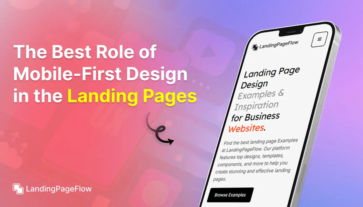
With the majority of web traffic coming from mobile devices, it’s crucial to design your landing page with mobile responsiveness in mind.
Ensure that all elements, including text, images, and forms, are easily accessible on smaller screens.
A responsive landing page adjusts seamlessly across different devices, providing a smooth user experience.
Test your page on multiple devices and screen sizes to guarantee a consistent look and feel across platforms.
6. Include a Clear Call-to-Action (CTA)
.webp)
Your call-to-action (CTA) is the focal point of your landing page. It’s what encourages visitors to take the desired action, whether it’s signing up for a newsletter, downloading an eBook, or making a purchase.
Make your CTA button stand out by using a contrasting color and clear, actionable language. Instead of a generic “Submit” button, use specific phrases like “Get Started Now” or “Download Your Free Guide.”
Place your CTA in a prominent position, such as above the fold, to make it easy for visitors to take action.
7. Build Trust with Social Proof

People are more likely to convert when they see that others have had positive experiences with your product or service.
Incorporate social proof elements like customer testimonials, reviews, or trust badges to build credibility and instill confidence in your offering.
You can also include case studies, user-generated content, or the number of satisfied customers to further enhance trust.
Social proof serves as validation that your product or service delivers on its promises.
8. Keep Forms Short and Simple

If your landing page includes a form, keep it as simple and short as possible. Asking for too much information upfront can discourage users from completing the form.
Limit the number of required fields to the essentials—name, email, and possibly one other field relevant to your campaign.
By reducing friction in the sign-up or checkout process, you can significantly increase the likelihood of conversion.
You can always ask for additional information later in the customer journey.
9. Use A/B Testing For Continuous Improvement

A/B testing (or split testing) is an essential technique for optimizing your landing page over time.
Test different variations of your landing page to see which elements perform best.
This could include testing different headlines, CTA colors, button placements, or form lengths.
Analyze the data from these tests to make informed decisions on how to improve conversion rates.
Continuous testing and optimization help you fine-tune your landing page for maximum effectiveness.
10. Improve Page Load Speed

Page load speed is a critical factor in both user experience and SEO rankings.
If your landing page takes too long to load, users are more likely to abandon it before even seeing your content.
Optimize your landing page by compressing images, reducing the use of heavy scripts, and leveraging browser caching.
Aim for a load time of under 3 seconds to keep visitors engaged and improve your chances of conversion.
Conclusion
Designing an attractive landing page is about creating balance between beauty and functionality. A well-structured page ensures visitors know exactly what action to take.
Adding social proof and testimonials builds trust while reducing barriers that may prevent conversions.
Mobile responsiveness is no longer optional; it is a necessity for keeping potential leads engaged across all devices. Clarity in messaging keeps the user focused on the main offer without distractions.
Testing and analyzing performance regularly allows continuous improvements for higher conversion rates. Each small adjustment can lead to significant results over time.
Ultimately, a landing page is more than just a design; it is a powerful marketing tool. When designed effectively, it drives meaningful engagement, nurtures trust, and transforms casual visitors into paying customers.

FAQ
1. Why is design so important for a landing page?
Design affects how users perceive your brand and whether they take action. A clean, focused design improves trust, readability, and conversions.
2. What elements should every high-converting landing page include?
Key elements include a strong headline, clear CTA, compelling visuals, social proof, and a focused layout that avoids unnecessary distractions.
3. How can I make my landing page mobile-friendly?
Use responsive design, compress images for faster loading, and ensure CTAs are easy to tap on smaller screens. Simplicity works best for mobile.
4. What role does copywriting play in landing page success?
Compelling copy communicates value quickly, addresses user pain points, and motivates them to take the desired action.
5. Should I A/B test my landing page?
Yes, A/B testing helps you compare versions of your page to see which design, copy, or CTA performs better, leading to improved conversions.
6. How do I track landing page performance?
Use analytics tools to measure metrics such as bounce rate, time on page, and conversion rate. Tracking ensures you can refine strategies effectively.


.webp)


